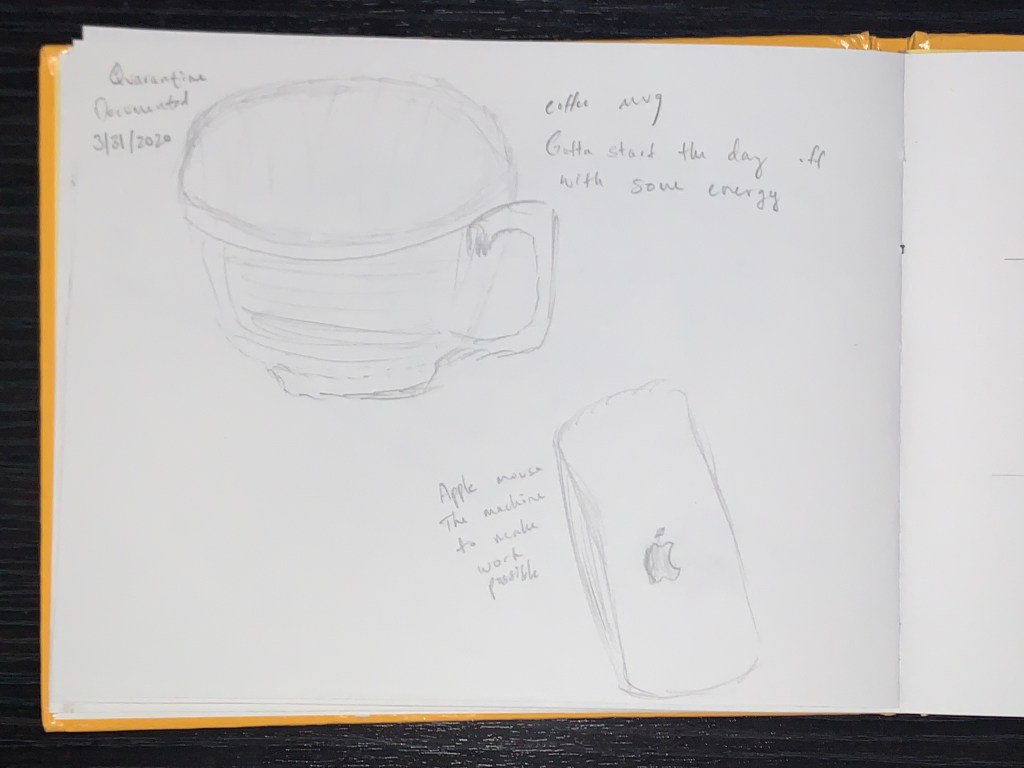
In my daily routine I’ve been drinking a lot more coffee to wake up on time, and also sitting at a desktop for hours at a time doing work for multiple classes I’ve found that my Apple magic mouse has been very useful.
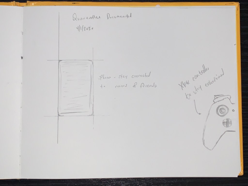
Obviously I’ve been using my phone almost non stop to stay in touch with my friends and up to date with the news, and also a lot of Xbox because of the extended free time I now have.
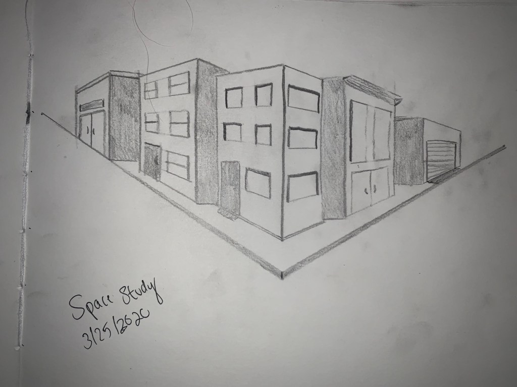
I was looking at a photograph of a nearby town in my house as a reference for this space sketch. It’s a great example of space as it shows a two point perspective of some buildings and a street. The reference is printed on photo paper and the sketch is graphite on drawing paper.
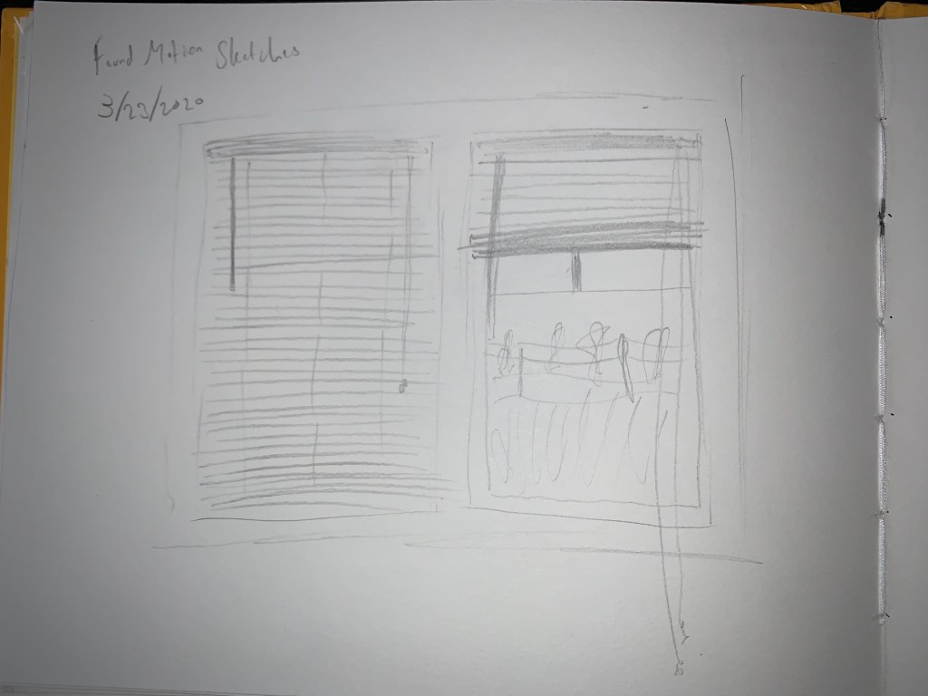
For this found motion sketch, I looked at the blinds in my room. I set one down and one up to show the possibility of movement and what happens when one moves versus when one stays down. The blinds are made of plastic and the sketch is graphite on drawing paper.
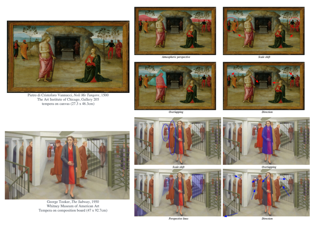
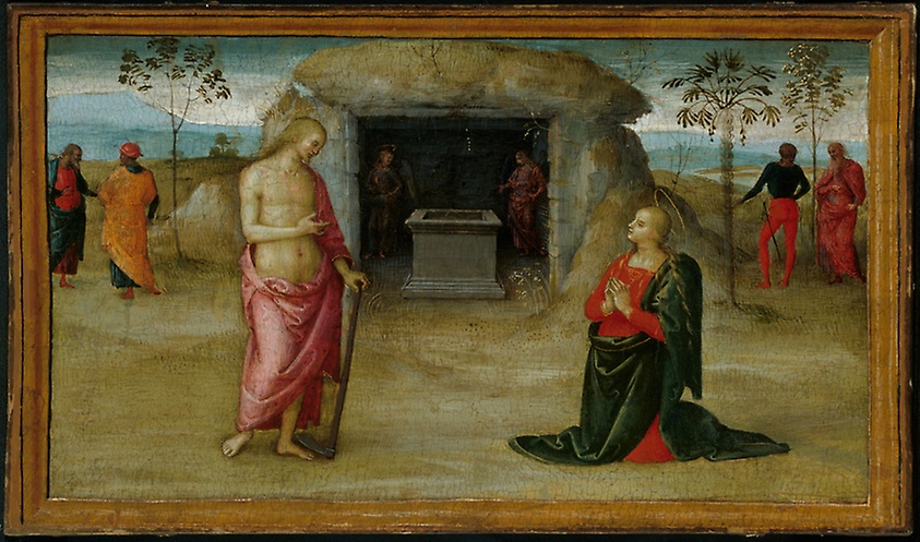
Pietro di Cristoforo Vannucci, Noli Me Tangere, 1500
The painting Noli Me Tangere is an excellent representation of an early form of space in painting. Vannucci uses atmospheric perspective to create an illusion of a far away background as well as a scale shift from the figures in the foreground as compared to the background.
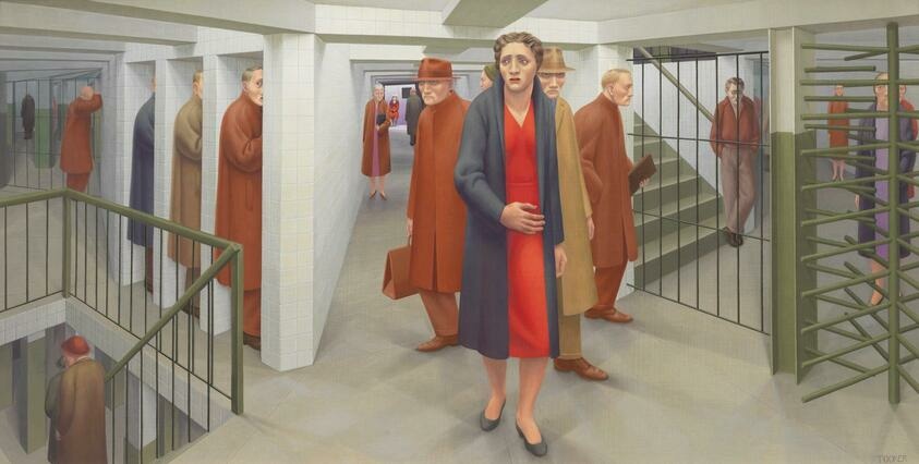
George Tooker, The Subway, 1950
Tooker’s The Subway not only creates a confusing scene but also an illusion of a multidimensional space. The two point perspective of the hallways makes the space almost endless, while the scale shift of the people farther away shows that there is definitely depth to the confusing subway station.
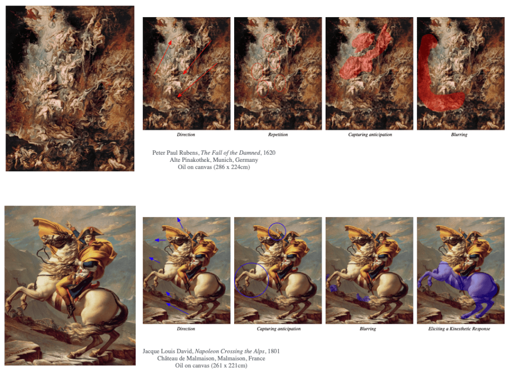
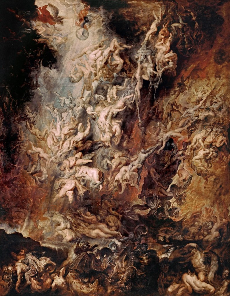
Peter Paul Rubens, The Fall of the Damned, 1620
Rubens’ 1620 Baroque oil painting represents motion in art perfectly as the bodies are seemingly falling out of the sky. You can almost envision the scene happening in front of you, and his use of direction and repetition definitely add to the movement.
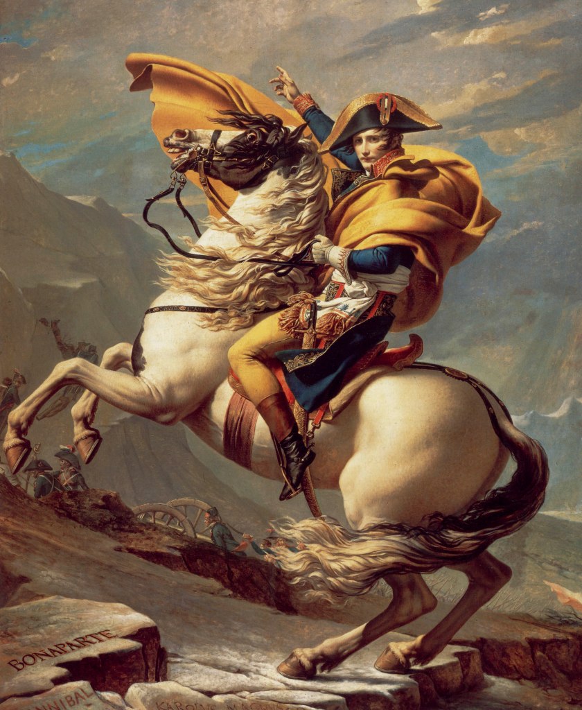
Jacque Louis David, Napoleon Crossing the Alps, 1801
David’s paintings throughout the French Revolution were nothing short of extraordinary, and his depiction of this fictional scene of Napoleon fits into a motion category in art history. The direction of the horse creates a sense of movement, as David also captures an anticipation or pause in the rearing of the horse to signify that it will keep charging forward.
Throughout art history, artists have used different methods in order to create space in their pieces. There was even a time when artists didn’t understand and couldn’t grasp one and two point perspective to create space. The following few artworks display a variety of methods that convey space to the audience throughout art history.
The work Noli Me Tangere from a gallery at the Chicago Art Institute uses a few basic methods to convey space. The scale shift of the people in the front from the people in the back creates a foreground-background idea where the smaller people appear farther away. An idea of atmospheric perspective of the clouded mountains creates a background in the distance, adding to the idea that the space in this painting is pretty vast and extensive.
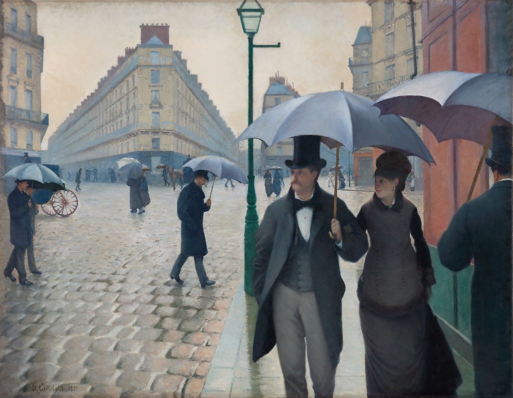
Another piece from the Chicago Art institute that has excellent ideas regarding space is Paris Street; Rainy Day by Gustave Caillebotte. This painting displays a great understanding for two point perspective as well as a scale shift of the people walking, making it appear that the smaller bodies are walking away from the viewer as the two in the foreground are walking towards the viewer.
George Tooker, The Subway, 1950
On display in the Whitney Museum of American Art, one of my “least” favorite (a very confusing one) paintings creates a very complicated illusion of space. The focal point of the woman seems confused about the space of the subway station, as should the viewer be. There seems to be an idea of two point perspective of the endless middle and left hallways, and a three dimensional aspect of the staircases going up/down into space. One of the main takeaways from this painting that I have every time I see it is the confusion of the woman as there appears to be no exits, and the mindless movement of the identical men in the subway that can allow for many different interpretations.
My score for the color test was a 2. The areas that were hardest for me (where the 2 came from) were hues 23 and 24 that are between green and blue (teal). In order to complete the test I places chips where I knew for sure they belonged, then with the rest I swapped them until it looked right. This was useful because I now know that blue-green is an area I should get feedback on now to make sure it’s right.