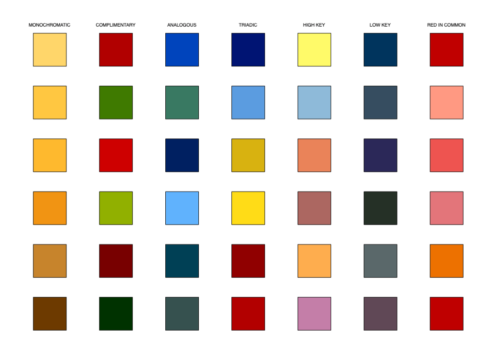

Monochromatic 
Complimentary 
Analogous 
Triadic 
High Key 
Low Key 
Red in Common
The first piece that caught my eye was done by François Morellet and it consists of 40,000 red and blue squares.

What really struck me about this work is the literal randomness of the squares and the feeling that it achieves. It almost hurts your eyes when you look at it for too long, and the “only” thing that went into it was assigning evens or odds to red or blue and going through thousands of phone numbers to pick what color to paint on each individual square. While this may seem like an ineffective way to create a piece like this, it communicates that Morellet’s idea was to create something unpredictable but at the same time tamed by the lack of variety in color choice.
Another work that stuck out to me was a piece by Ellsworth Kelly who used a method that we just did – cutting and pasting color coated paper, but instead he did it randomly in order to convey a fuller piece of art.
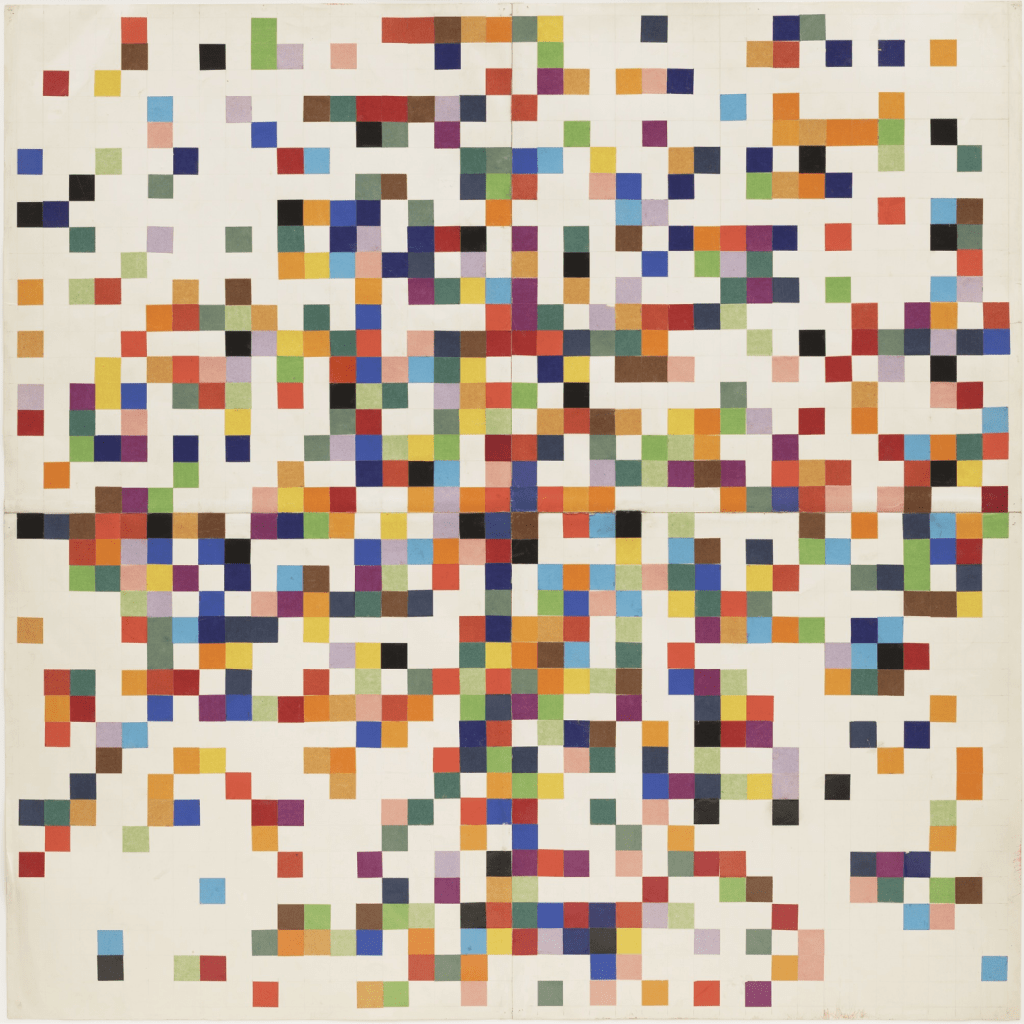
This piece stood out to me instantly because it reminded me of how my workstation looked as I worked on the hues from project 1. He randomly assigned each color chip to a place on the collage, and while our project was more methodical, he used the same method of small squares to achieve this look. Because his method was also randomized, it suggests that he didn’t have a strict end goal but wanted to communicate the relationships of each color chip in the piece.
Throughout this first project in Design & Color, I didn’t only learn a lot about the process of mixing and creating colors with gouache but about myself and my capabilities as well. Switching from an economics major to a graphic design major is a big jump, especially with my only art exposure in the last 5 or so years being one photo + design class in high school. While painting 50-100 chips isn’t exactly what I expect myself to be doing 5 years down the road, the basics of color are definitely a baseline I’ll need for a successful graphic design career. I definitely impressed myself towards the end of this project, and after being intimidated with my classmates’ skills towards the beginning I’m pleasantly surprised that the work I produced looks and feels successful.
Not only was this first project a good experience for me to kick off more art projects like this in the future, but it was humbling as I can now compare myself with the people around me and always have a little competition in the back of my mind which will be key when I have to build my graphic design portfolio that will be compared to hundreds of others when entering the field. For now I’m happy with my entrance into the program but I have to stay committed and maintain a high level of work ethic that I’ve been working on developing throughout the semester. Included at the bottom of this post are glimpses of my notes throughout our lectures.