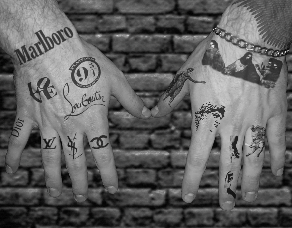
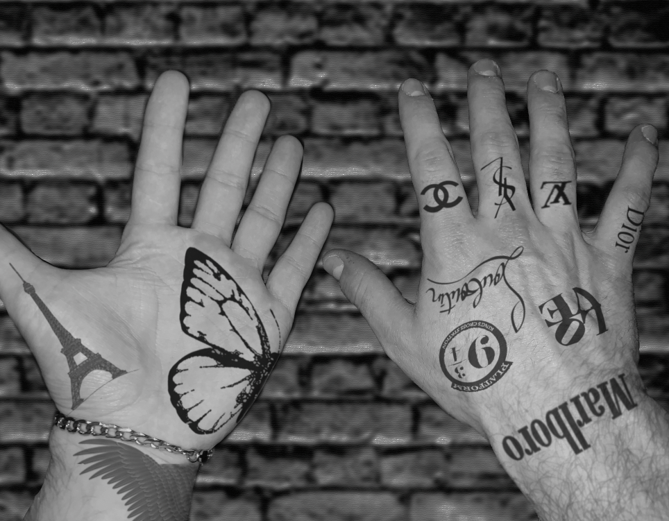
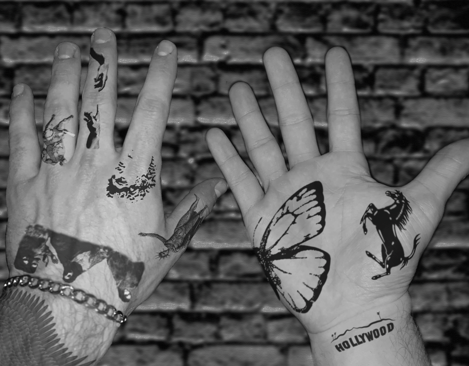
I have been using mostly Photoshop and image galleries online to create these mockups. Down the road, I will likely add more images of my hands in slight movements and then print them and create a flip book sort of thing to really apply motion techniques to the end product. To explain again – hand tattoos are pretty uncommon for people my age, so I wanted to create digital mockups of what they would look like on me. Both my hands highlight what can be good or bad about the tattoo art industry, as one hand is marked up with logos and such and the other is covered in historical art pieces. The final product will look like a digital gallery of a few images and likely a physical flip book to highlight my hands’ movement and the movement of the art on the skin as it stretches and morphs.
Category: 2dblog
Project 3.2 Material Studies
For project 3.2, I have begun my studies with tracing, rubbing, photography, and digital mockups to further my knowledge of the project. Since I will be focusing on movement and spacing of tattoos as artwork, my studies reflect many of the ideas that go into creating, tattooing, and the final result.

Tracing helped me understand the movement and spacing of the line work that is present in every tattoo. Since lines are an essential part of every tattoo, tracing was a basic way to start a study of line and spacing that must make sense in order to create a successful tattoo or design.

The next method I used to further my studies was rubbing. While this didn’t expand my knowledge as much as tracing did, it helped me understand that even seemingly two-dimensional designs can be altered or warped to create an idea of texture, depth, and space.
One thing that really helped me understand the movement of tattoos across the body was photographing my own tattoos and observing how they stretch and warp with the skin as they tend to wrap and morph with movement of the body. This was also very helpful as I had a reference to understand how tattoos can be rendered onto skin digitally, which is evident in my mockup below.
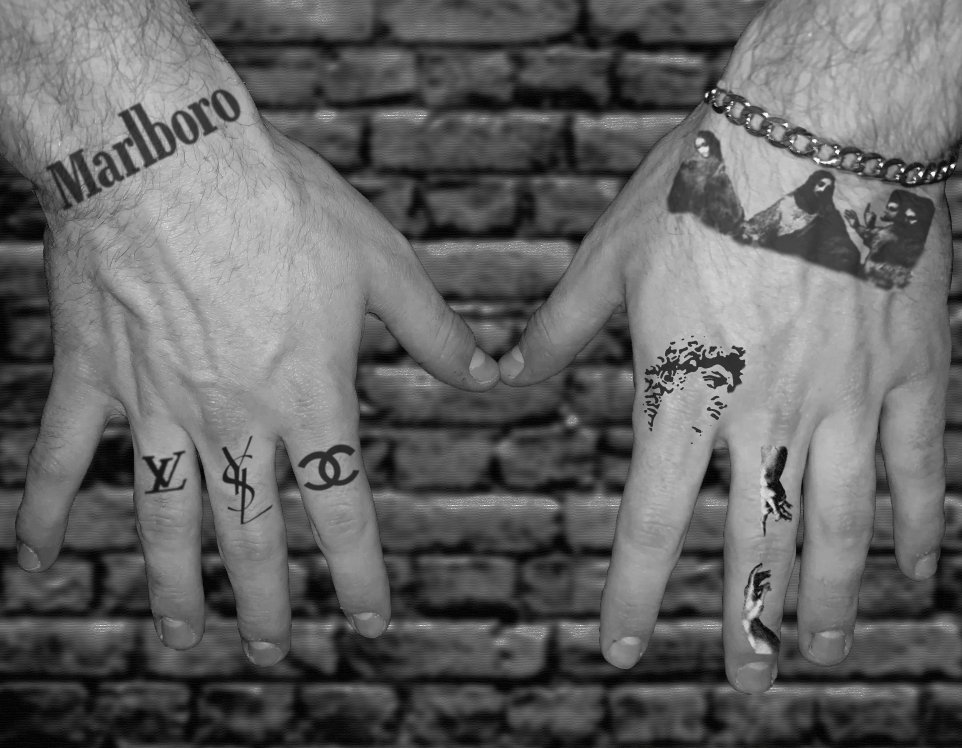
This is the beginning of my project, developed in Adobe Photoshop. I found that this program was much better and produced a lot more realistic results than Graphic can. I not only utilized graphic designs, logos, classical art images, and a digital software, but photography as well (my hands are in the image). It’s a long and difficult process to be able to make each “tattoo” look not only digitally but physically realistic, but with warping and filter tools I think I’m getting a hang of it. While this doesn’t represent a classical view of movement, I think that the movement of the ink as it warps around skin is something that’s evident on anyone with tattoos. I believe that tattooing can be a very refined art, but at times not as respected, just like most other forms of art (such as photography). With that in mind, one of my hands is supposed to be a sort of a walking billboard, and the other is a reference to classical art and the beauty that tattooing can have. Looking at tattoo artists’ Instagrams and ideas on Pinterest will help me further develop the mockup, as I would like to almost completely cover my hands in the process. This is still the beginning stages of my project and I’m still brainstorming on how I can incorporate more movement into the final design and product.
2D Project 2 Recap
Variety in art can be simply defined as anything that add additional interest to a design rather than the surface or subject of the art. This is useful in art making because once you get past what you want to represent in your art, you can extend it to create variety, add interest, and make a piece that really speaks to an audience. I think this knowledge of variety can apply to other forms of art when you add the use of balance, emphasis, scale, and rhythm. In drawing, it’s important to represent something realistically (if that’s your goal) but also add a form of style which can also create variety. In graphic design, it’s crucial to have variety in your work so it stands out from basic images that can be glanced over and not even considered as art. This is definitely something that should be known for any artist or graphic designer for their work to develop their own style and get recognition and succeed.

Mission Statement
My personal mission statement is to use my own creative energy and personal understanding of the world around me to create unique work that speaks for itself. The ability to be understood by different people in different contexts each in their own way is important to me; if I have an intent in mind for a certain piece it should always be detached from the viewer’s opinion as everyone understands art differently. Unique work is hard to pursue as it’s easy to get inspiration on social media and ultimately reproduce something already done. Personal and unique style isn’t something that comes overnight, it must be worked on for years to finally be complimentary with one’s goal. Nevertheless, in order to develop my own personal style I have to trust my creative understanding and knowledge of the essence of the present day.
Found Gestalt Walk
For the found Gestalt walk assignment I went to the Cox Arboretum which is one of the five Rivers MetroParks. Throughout the walk I tried to pay attention to the 6 Gestalt principles as well as the well-maintained park around me. The things that caught my eye the most were brighter colors, especially green, as it is only February still, so I tried to incorporate those into my photos. The architecture present in the arboretum was really interesting as well so I gathered some of that too. I think my most successful images are my containment ones, as the pipe is containing the area inside of it and the twisted branch is almost holding the tree in place. Some of the other principles weren’t as easy to find in nature like repetition and closure which don’t often occur naturally. However, because of my success on the containment photos I will be choosing one of those for my digital drawing.

Closure 
Repetition 
Proximity 
Grouping 
Continuity 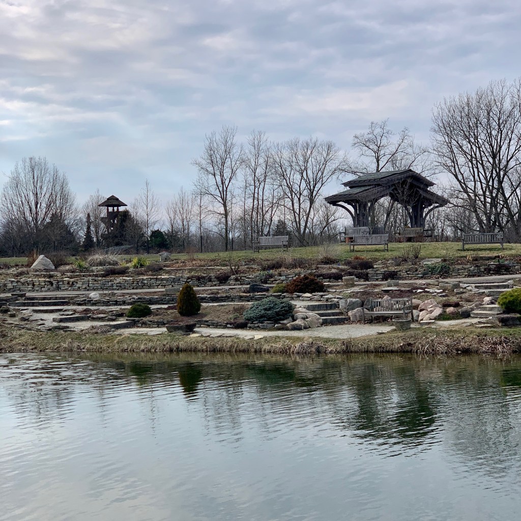
Proximity 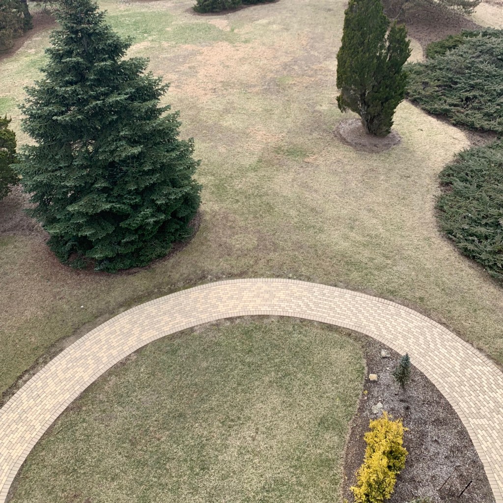
Closure 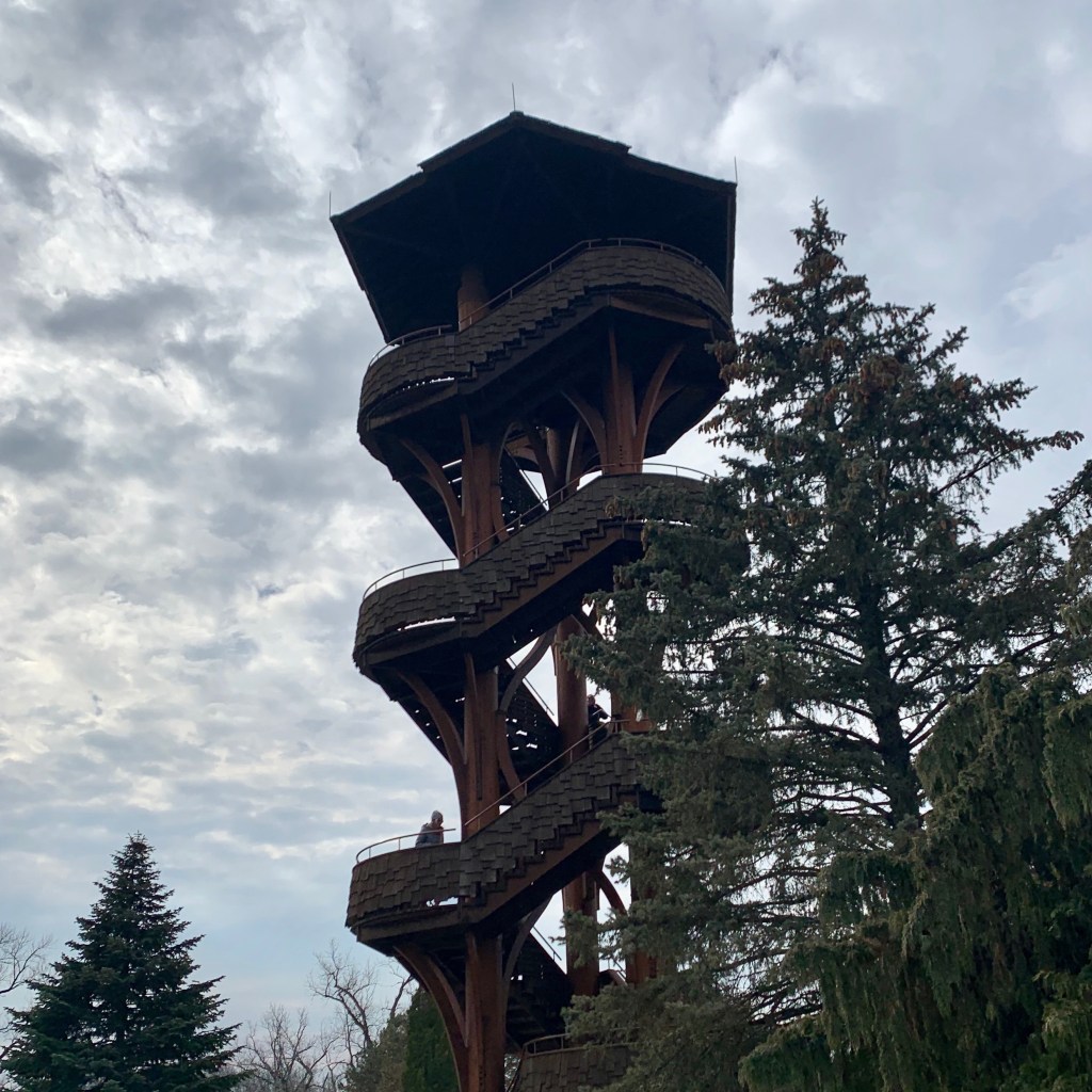
Repetition 
Containment 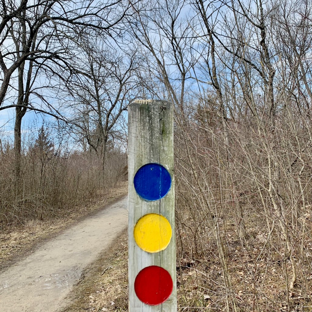
Grouping 
Continuity 
Containment
Project 1 Recap
The first project of the Gestalt designs and the principles of design photographs allowed me to be creative while also demonstrating my knowledge on the concepts. Regarding the project guidelines themselves, I liked how they were straightforward and not too creatively demanding, but on the flip side, the strictness of the project also limited my (and everyone else’s) potential of creating something very unique. Every final project looked very similar, however this is also the result of this being our first project. One thing I would consider changing is loosening up the guidelines on the Gestalt circle designs which could push the designs even further.
Throughout this project I learned how organized I have to be when completing work like this. Also, the critique somewhat validated my work as it seemed to me like my designs were understood and appealing to the class. I also found out that I like to be very precise, neat, and organized with my designs and artwork which will help my style evolve moving forward. Despite being a little creatively limited, this was a valuable project that will be a baseline for my work in the future.
Art & Fear Response
In Ted Orland and David Bayles’ Art & Fear, they discuss the causes and effects of fear on the art we produce. They break it down into two major categories: fears about yourself, and fears about others. This is an interesting concept, because while one can be applied always (fears about yourself always come into play whenever you make art), fears about others isn’t necessarily always applicable because sometimes work isn’t shown to the public.
Many interesting points are made by Orland and Bayles when concerning fear about yourself. Specifically, emphasis is placed on a commonality of a fear of only pretending in your art, not having enough talent, a constant worry on perfection, an annihilation of work when not produced consistently, and having unrealistic expectations of our work. When you get in your own head when creating artwork, it’s easy to assume your work isn’t good enough or shouldn’t even be shown in public. However, this is just one of the things you must overcome on the path to improvement in your work. You have to trust the unconscious elements of your creative mind taking presence in what you create. Everyone creates something for a reason, and the same original idea can’t be fabricated by the same two minds. Everyone’s creative energy is unique, therefore everyone deserves a confidence in themselves when creating.
The other side of the argument is the aspects of fear about others judging our work. Some of the points made regard others maybe not understanding our work the way we intended, others not necessarily accepting it as “art,” and others not approving it or “liking” the work. The authors emphasize that yes, it can be scary to be vulnerable and put your work into the public for others to criticize and evaluate, but no one ever got better by not listening to the opinions of others. One of the most interesting points made earlier in this piece was the author who forced himself to write seven pages a day no matter what, which would really improve his work and (if he was listening) therefore the way in which the public viewed it as well. Making art consistently and confidently is something I struggle with, and it takes a lot of determination and creative steadiness to do this. Reading this definitely changes my opinion on what it means to be a (artist) graphic designer because I didn’t always consider it “art,” but it definitely is when the whole picture is considered. Like any artist, I have to stay consistent to be able to improve, increase my confidence in myself, and let go from allowing the critique of others get to me personally.
Value, Elements of Art, Principles of Design, and Gestalt
A key concept while thinking about the principles of design is value. Put simply, value is the emphasis on the lightness versus the darkness of color in a design or work of art. Below is a value scale depicting a basic concept of value. Value allows artists to create contrast or place emphasis on specific areas of their design just by making one area darker or lighter than another.
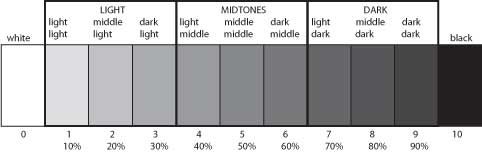
The concept of value can be further split up when other ideas, such as distribution, volume, space, and lighting come into play. Perfected in the Renaissance, the term chiaroscuro (Italian for light and dark) allows value to create dimension when the contrast and drama between the light and dark is heightened.
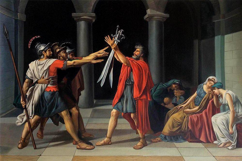
Another key concept when highlighting the principles of design is the use of unity and variety. Going hand in hand, unity essentially creates a wholeness from the successful combination of elements in an artwork. Unity can be conceptual (based on a variety of ideas) or visual (based on the elements of art), while variety is used to combine elements to create relationships to offset unity and add interest. Below, Jacque-Louis David’s Oath of the Horatii can be used to describe the relationship between unity and variety. The sons are united to their father, family, and patriotism through their movement towards the swords in the center, while variety is represented by the mourning women off to the right. This piece not only can be used to represent unity and variety, but repetition as well. Repetition is the use of multiple of the same element to create emphasis. The repeating hands and swords draw the viewer to the center of the image and what the gesture symbolizes.
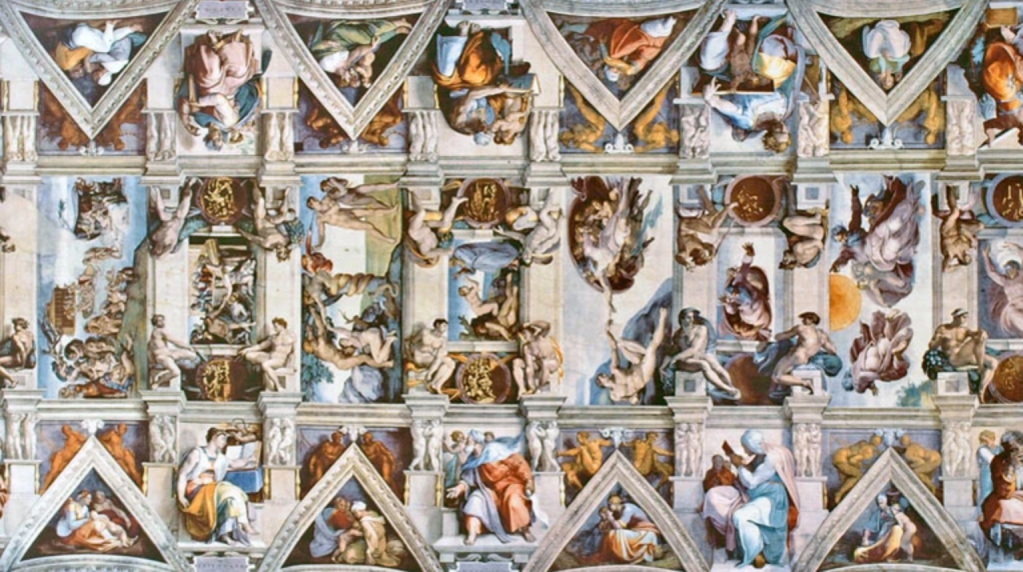
Another principle of design is an emphasis on patterns and grids. This is the use of a visual element’s repetition to create a system of design. This goes hand in hand with closure, which is the brain’s creation of a complete form. These principles can be represented in Michelangelo’s fresco paintings in the Sistine Chapel, as a pattern of multiple scenes in combination with the closure of the elements of the ceiling’s built-in supports creates a decoration with complex forms and backgrounds. Furthermore, the concept of rhythm (combination of elements repeated, with variations, to create a sense of movement) can also be applied here.
Many other concepts can be analyzed when considering principles of design and elements of art. Symmetry, or the sameness of one side to another (or approximate symmetry, which is used when one side is close enough to the other) allows for designs to be concise and straightforward. This leads into the idea of balance, or the arrangement of elements to create a feeling of stability.
Further, the ideas of scale (size of an object in relation to its standard or expected size) and proportion (size relationship of an object’s parts to the whole) can be applied to emphasize certain aspects of a design. A common example of this is the Hieratic scale, where significant figures are depicted the largest. This originally is shown in Egyptian art, but was made popular in several movie posters. The Star Wars movies used this in almost every movie poster they put out. Below is the movie poster for The Force Awakens, where all of the most important characters are shown the largest.

Most, if not all, of these principles and elements are used in order to create emphasis on a subject. Whether it’s a famous Monet or a middle-school art class project, any one of these can be used by itself or in conjunction with others in order to draw the viewer towards a specific area of the work in order to understand the piece’s subject.
