Blog Feed

How do you learn? Tom Sachs Response

The 10 insights that Tom Sachs took away from learning how to surf are as follows:

  1. Learn how to create a sacred space: many surfers view the act of surfing in different ways, yet it is a cultural activity in some places around the world that is considered “spiritual”
  2. Learn the code: it takes thousands of hours across many years to learn the fundamentals; Tom knows he and his team must first learn the basics to achieve success
  3. He understands: Tom and his team learn from locals and pros who have mastered the sport of surfing; learning from masters makes the process more rapid
  4. Compare & despair: Tom compares the process of learning how to surf to other aspects of his life that had a tough learning curve
  5. Get in the boat: The team is provided with a boat that takes them off the beach (and out of their comfort zone). Getting in the boat can also be interpreted as getting out of your comfort zone
  6. Be afraid: Similar to getting on the boat, one way to learn how to surf is putting yourself at risk so you will cherish the short time of riding the wave more
  7. ABP (always be playing?): Pretty much just have fun, enjoy your time. They had to take a step back and stop thinking of this learning experience as a chore because it really is just play
  8. Fail with joy: They had to realize that they would fail many times before earning a wave to ride, and like before had to accept that this was a fun activity after all
  9. Get hurt: Surfing isn’t the safest sport, and to have a proper learning experience they went all in, even if it meant getting a little banged up
  10. Persistence: Tom showed the graph of how long it takes to master surfing; he already had 1000 hours of experience and was still a novice, so a big part of this process definitely is persistence

These can all relate to learning how to be a designer as well. A sacred space is necessary for proper brainstorming and creativity. One must also learn the fundamentals of art (a code) before delving into massive projects as well. Learning from “masters” (professors) can definitely expedite the process rather than self-teaching. Comparing this process to a learning curve from another personal struggle will also help. “Getting in the boat” and being afraid are the ones that resonated with me the most when I compared them to the learning process of becoming a designer because a big problem I have is sharing my work and putting it out for the world to see, so getting out of your comfort zone is definitely a big step in the right direction. To contrast that, I have to remember that I picked this career/learning path for a reason which is that I enjoy the process and have fun doing it. Failing with joy, while it may seem counterintuitive, is necessary as well because everyone will fail at some point, and by accepting that fact will make it easier in the long run. Getting hurt likely won’t happen physically, but I could understand that a designer’s feelings could definitely be hurt whether it be through critique or turned down jobs, commissions, etc. Finally, another important one for me is persistence – I have to remember that I’m still a novice in the art of graphic design and will improve after every hour I put in.
Project 4

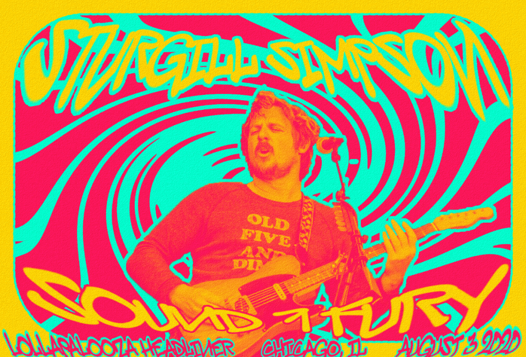
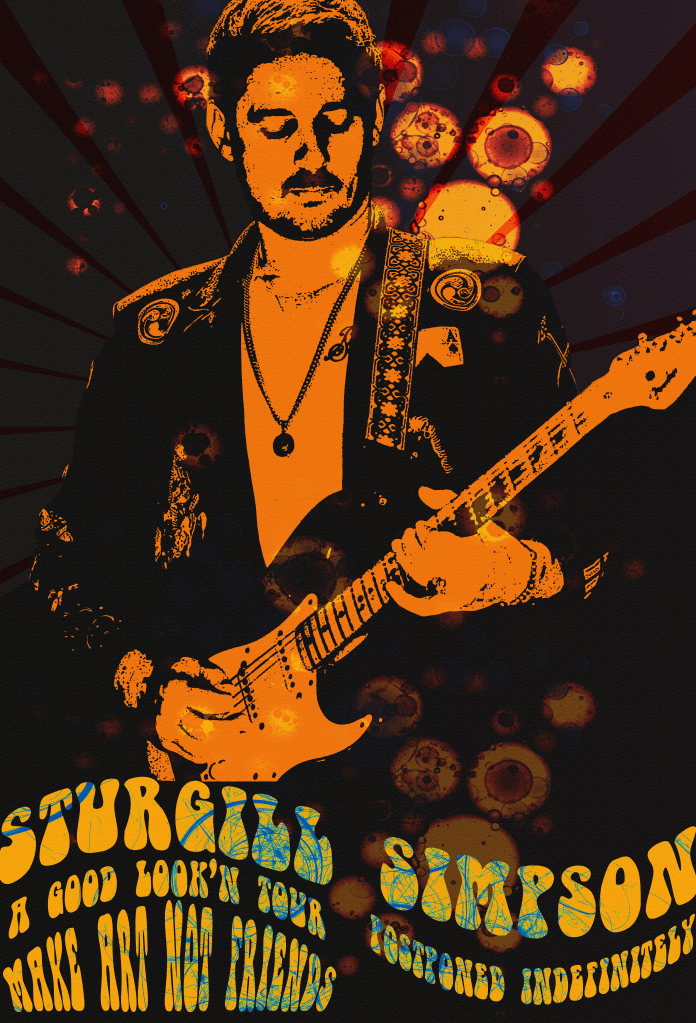
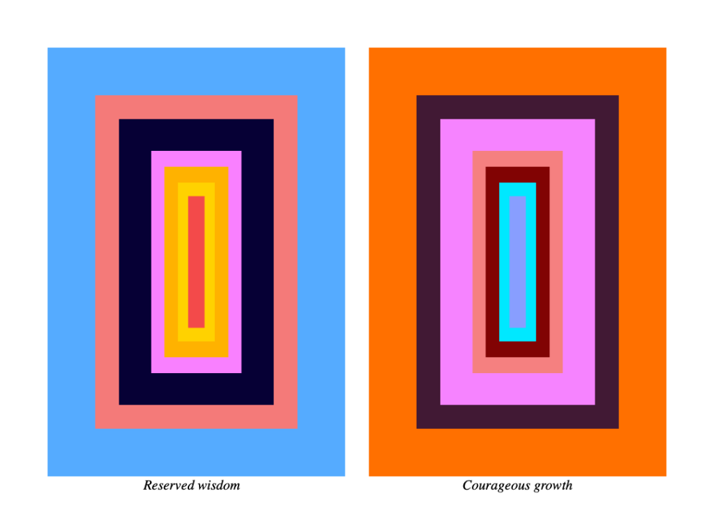
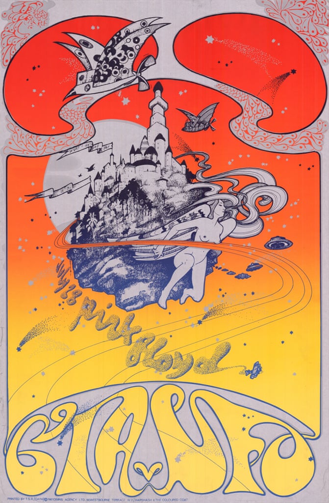
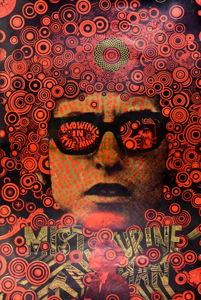
For my final project, I decided to adapt a style that artists used in the 1960’s to produce band posters while adding my own personal style. My subject for project 4 is Sturgill Simpson, a rock-country hybrid artist who recently tested positive after touring in Western Europe in February and early March. He was supposed to continue his tour in the United States and I was planning on going to see him in Louisville at the end of May, but he of course had to cancel his remaining shows after the pandemic swept the world. Included below are some images of inspiration including his most recent album cover for my color palette inspiration and a few examples of this 1960’s style.

Sound & Fury (Sturgill Simpson), Cover Art, 2019

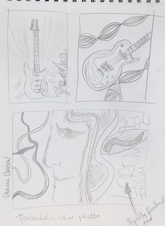
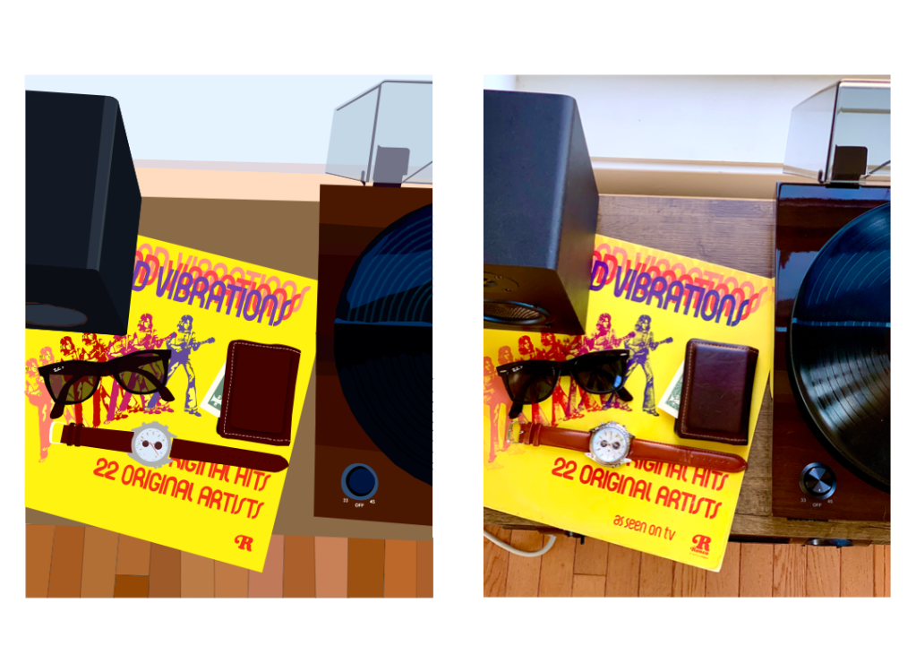
Because I don’t usually sketch mockups for digital design projects like this, my ideation was pretty simple on paper but got more complicated when it got to Photoshop.

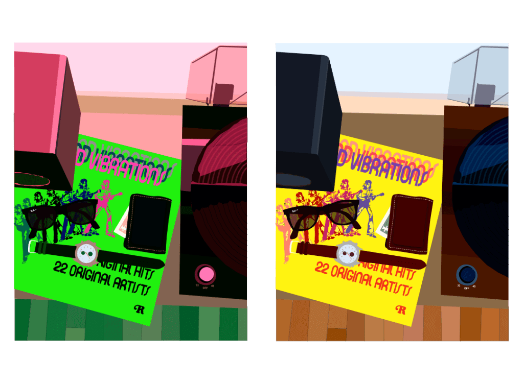
As I continued into Photoshop, I first wanted to use a pastel palette, but soon realized it didn’t really represent my style or his either.

Finally, I delved into downloading custom textures and fonts, and adapted a color scheme from his most recent album cover to combine my various inspirations. This is the final version of my Project 4.

Project 4 Final by Peder Harvey

Relativity & Op Art Research

Josef Albers was an educator, artist, and experimenter of color who was influential in art and psychology in the mid-20th century. In color theory, he utilized a trial and error method in order to come to his own conclusions, such as the relativity of color based on surrounding, contrasting colors, or the interaction of colors hinging on the illusion of the human eye. In this article, I found it surprising that he utilized such a method to discover revolutionary aspects of color that are clearly still relevant today in all artists’ research. Instead of a methodical approach to his research, he used a more primitive method with which he discovered radical ideas. The most interesting aspect of his findings, for me, was how he believed that the brain cheats us when it only sees what is expected, which made me analyze how I view (my) art, and will possibly affect me in my future work. I also learned that there is a foundation in him and his wife’s names, which stands for all aspects of art and the visual experience. Another thing I learned from the embedded links is that Albers has been compared to work of other psychologists interested in color such as Johann Wolfgang von Goethe, who refuted Sir Isaac Newton’s color theory by asserting that darkness is an active component rather than just being the absence of light.

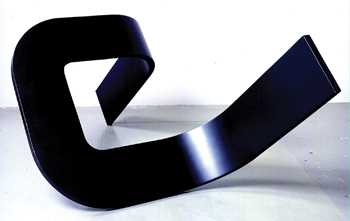
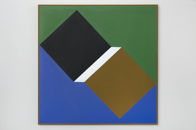
Optical artist Tony DeLap was a prominent figure in the same category throughout the 20th century. He viewed his art as a competition with his ideas, always believing that a process or ideation for a work will always change as it progresses which is where the art comes in. Many of his pieces involve drawing, painting, sculpture, or a combination of multiple. Below, I’ll post some images of his work followed by my experience viewing them and my interpretations.

This abstract sculpture, titled Modern Times III from 1966, reminds me of an optical illusion like the impossible triangle. The fact that it’s all black is meaningful too, suggesting to me that just because the sculpture cuts off at two points doesn’t necessarily mean it “ends.” The darkness of the hue on the sculpture really hands the interpretation of the piece off to the context or setting it’s in, as the light in this image may not look the same as it would in a different place. Therefore, to me this can be interpreted in many different ways based on its context, but overall seems to be a multidimensional sculpture with very few visible expressions.

This painting, titled Card Trick from 2014, reminds me of a very basic 3-dimensional drawing that one would make with a stencil or ruler in an intro to art high school class. However, the relationship of the colors is what really makes it stand out. The coolness and symmetry of the blue and green sides make the geometrical shapes in the center stand out. The longer I stare at the white rectangle in the middle makes the relativity between the two squares get closer and farther away simultaneously, which makes me believe the color choice of white was very intentional as a focal point to really draw the viewer to engage in this optical illusion of a three dimensional space.

Project 4 WIP

For Project 4, I decided to document some of my favorite artists in a style that was very popular in the 1960’s and 70’s. The exploration of chance is relevant in these mockups and early ideations as the color and poses in the images not only conveys the musical ability of the artists but also the art they produce with the coloration and graphic boldness of the mockups. Narration is used here because both artists produce music that relates to the color and style of the digital art. Additionally, one of my favorite artists, Sturgill Simpson is not only a musical artist but supports graphic artists as well, such as the animation of his most recent album (Sound & Fury) which he turned into a movie of sorts that’s available on Netflix. Sturgill recently tested positive for Covid-19 as well after touring Western Europe at the beginning of the year so this is a tribute to him also.

Project 3 Recap

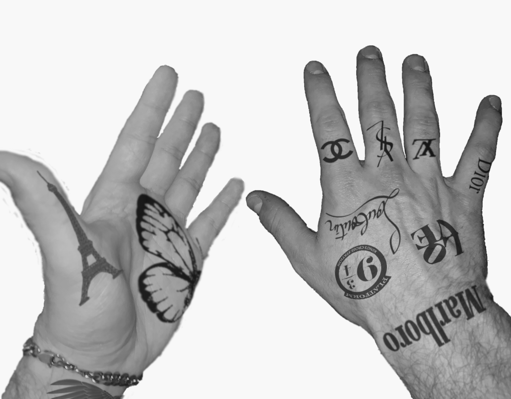
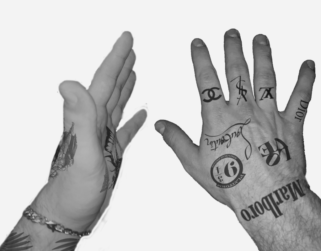
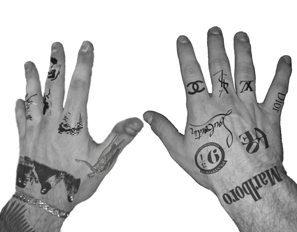
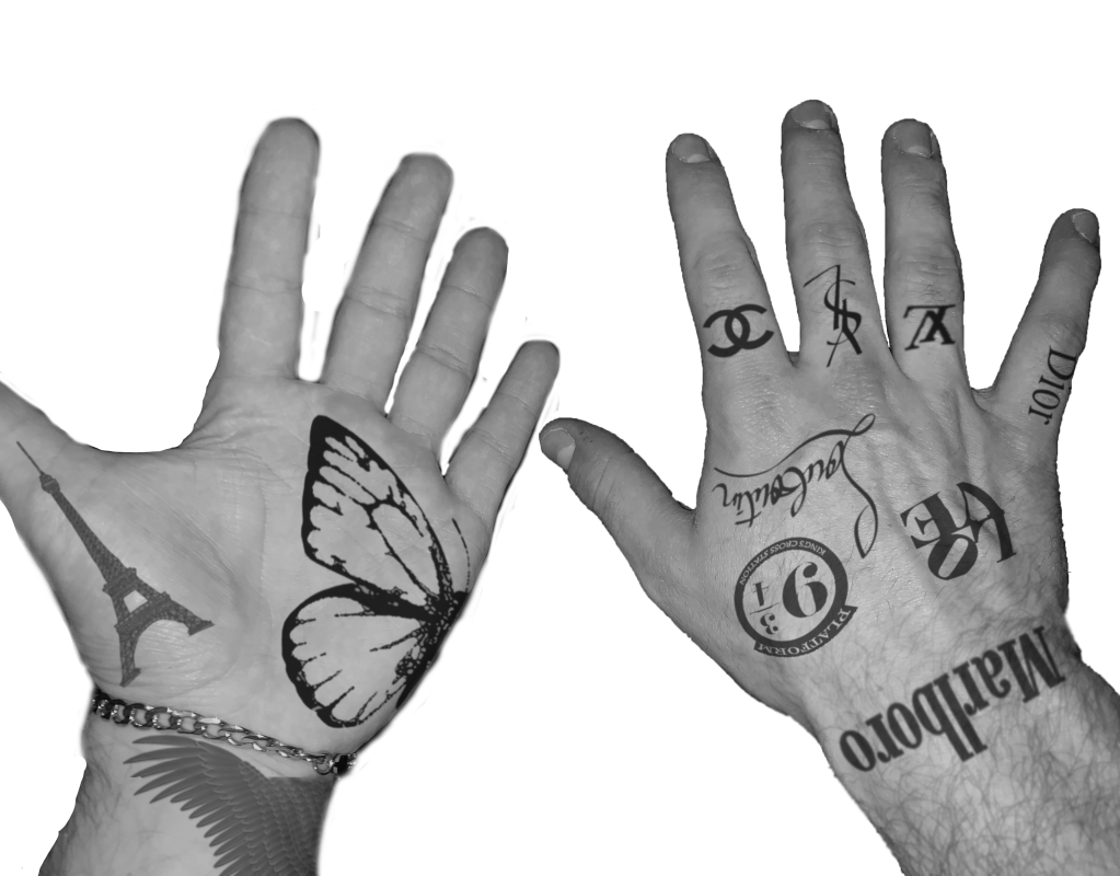
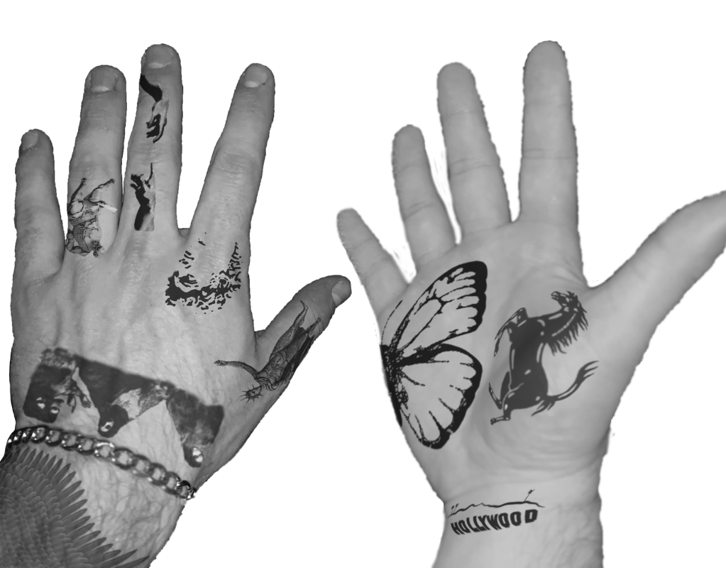
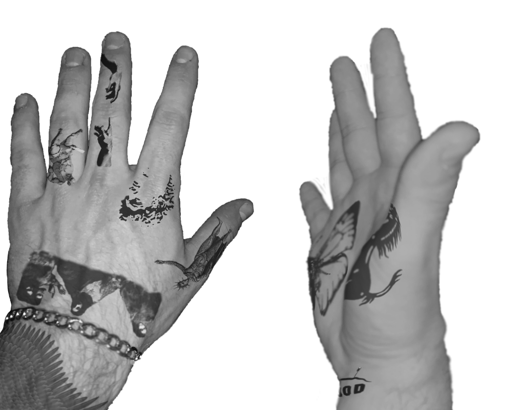
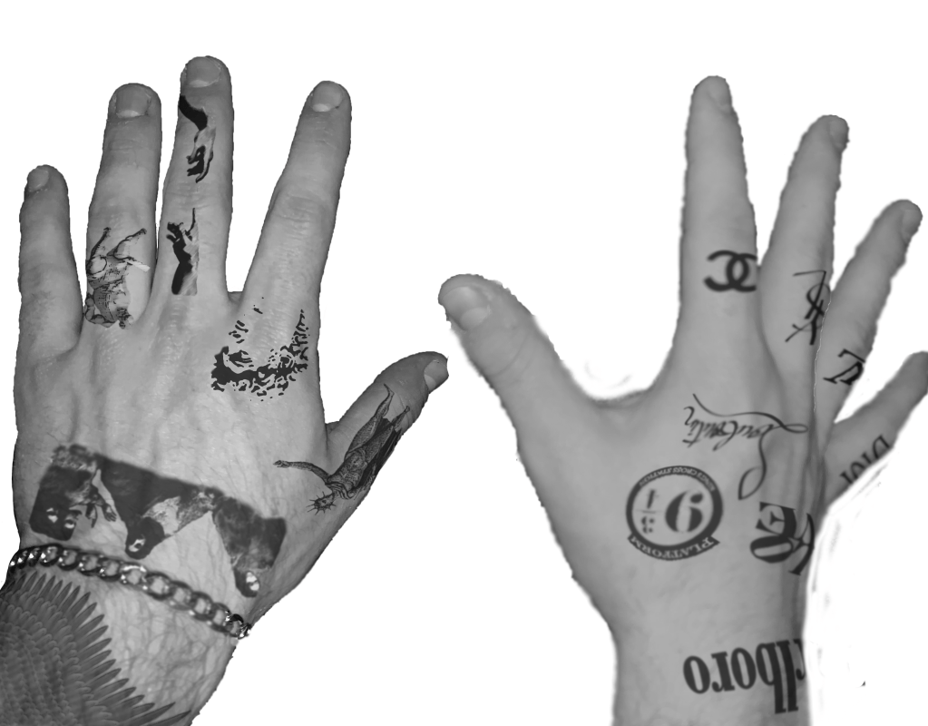
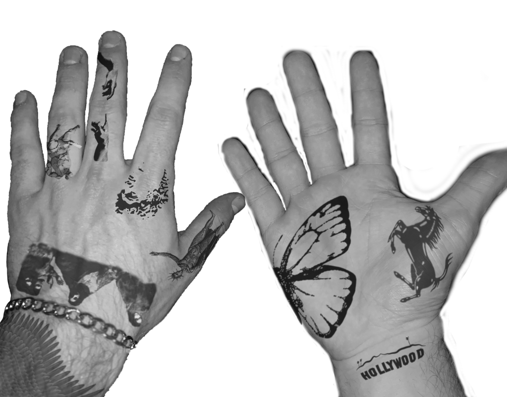
My goal for project 3.2 was to create a series of mockups of tattoos on my hands in a series of images that would convey motion. The motion is not only my hands moving but the movement of the “ink” as the skin stretches and warps in different placements and setups. Each mockup was created on Adobe Photoshop using photographs of my hands, then “tattoos” were added using Photoshop tools like warping, filters, and opacity. Then, the images were all printed and inserted into a physical flip book to push the idea of motion, which is captured below in a series of short videos that utilized the live photo feature on the iPhone.

The message that is conveyed with the distinct themes on each hand is the positives and negatives of tattooing as an art, or art in general. One is a “walking advertisement,” as many popular logos are used. This is a seemingly unoriginal way to approach art because these logos are unoriginal and promote materialism, while the other hand promotes classic art. Even though the inspiration for the classic art hand reuses pieces from art history, this is a more legitimate approach to tattooing and art in general as the reproduction of paintings is both a nod to the historical significance and the preservation of such important masterpieces.

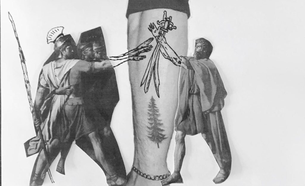
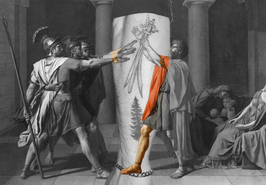
For the second deliverable of the project, I decided to use one of my own tattoos as inspiration. I have a detail of Jacque-Louis David’s Oath of the Horatii, 1784, on my outer forearm. I used Photoshop again to combine my tattooed arm and the painting to convey the motion of the arms’ capturing of anticipation that is evident in the actual painting. Not only does this signify the almost perfect scale and proportion that the tattoo artist left on my arm but the kinesthetic response that will be on my skin forever. For the physical aspect, I printed parts of the painting and a photo of my tattoo and added in pen detail to make the image half printed and half in ink like a tattoo artist would use.

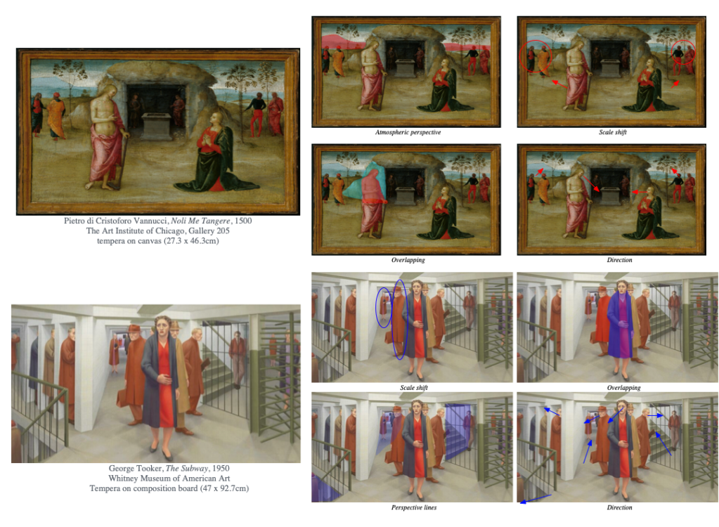
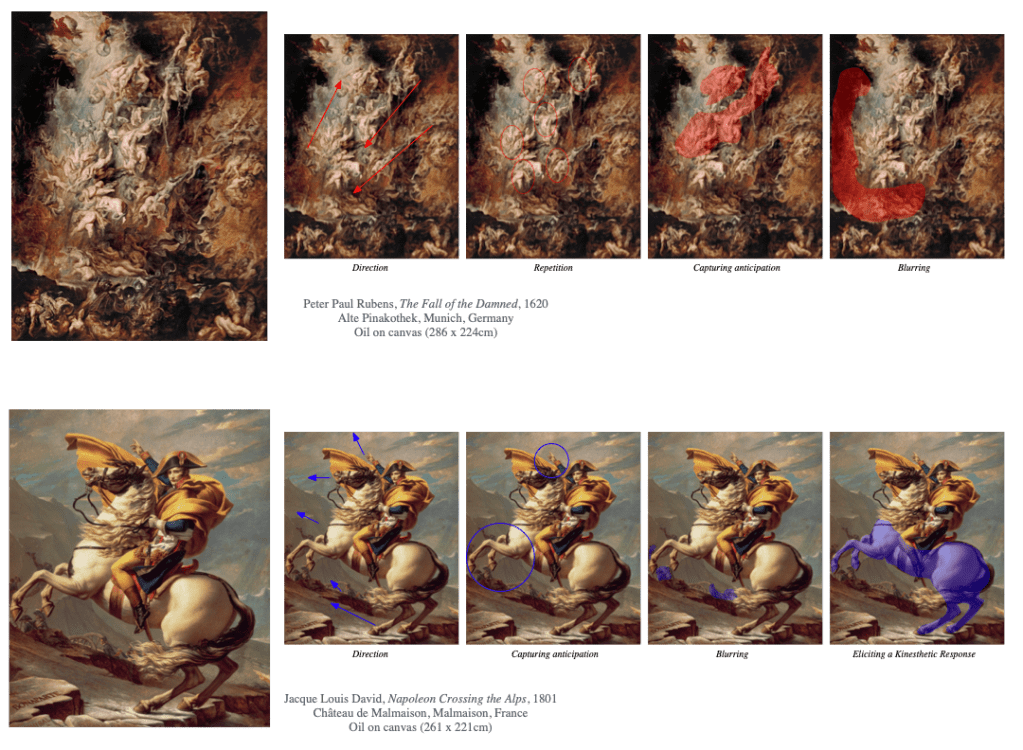
For the mapping aspect of the project, I used some of my knowledge from taking an art history course last semester to influence my choices in paintings. I learned that one point perspective wasn’t really discovered until sometime in the early 15th century, and not all artists utilized it commonly for awhile after. For that reason, I used Noli Me Tangere which was painted in a borderline 1500, so it doesn’t as comfortably use one point perspective as later paintings would. This creates an interesting illusion of space as atmospheric perspective was more heavily relied on. For The Subway, this is one of my favorite and also most confusing illusions of space in a painting which is why I wanted to analyze it. In The Fall of the Damned, there’s just so much going on and you can zoom in and look at details of it for a long time while imagining the motion taking place at the same time. Finally, Napoleon Crossing the Alps by my favorite painter David does a perfect job of capturing Napoleon on his horse mid charge (even if it never actually happened).