Blog Feed
Wearable Art
For the wearable art artist to research, I picked Héctor Sos, and more specifically his “Paper Faces” project. The purpose of this project was to animate the publishing and printing industry as real and alive, and he did that by creating multiple textures of a simple thing like paper, then covered faces of models who were then photographed. He extended this idea by also printing/publishing the work in a book, making it a four step process where paper is involved in two of the steps.
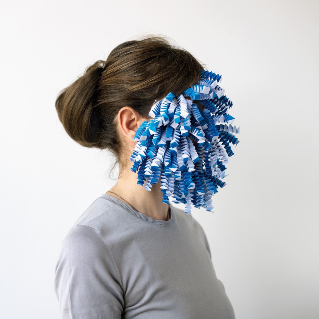


Personally, I looked past the metaphor with his printing process and thought about how this art could express a person’s emotion without being able to see their face. This first paper face manipulates the body by extending the face with many pieces of square paper that seems to have been folded. The second uses pieces of black paper cut into diamond-like shapes, arranged to look like flowers or bows with a crease to give it more texture. The third uses multiple rectangular shaped pieces of small colored paper arranged in a random fashion.
The emotions that each one made me feel vary. From the first one I read calmness, but with a little bit of hidden sadness. The folded pieces alone make it feel kind of crazy, but the fact that they’re all aligned and positioned the same made it more put together, and the blue that is kind of under the white gives me this hidden idea of sadness or something under the surface.
The second one made me feel more like this person is judged from their possibly dark demeanor, but on the inside is a really great and gorgeous personality because the more you look at this dark layout you can see how the flowers line up and are pretty cool to look at.
The third made me think of a stressed out college student who puts a lot of time into their work but isn’t ever satisfied. The many colors of this one and the shape made me think of those little post it notes that we’d use when annotating books for class and how they always stuck out of the books. Their arrangement and many different colors gives me a high-strung student vibe that is associated with a lot of craziness in their schedule and high stress levels.
Through this way of using just paper a lot of creative things can result. Even though they’re all the same material, different feelings can be translated from each work which I appreciate. Through this way of making, a lot of attention has to go into the details of how it’s arranged but can omit something really special. I’m not sure I would go this route because of how abstract it would be and I’m not sure I could garner that much meaning from a single material, but if I were to go the single material route I think I would make something actually wearable and more tangible.
Object of Affection Recap
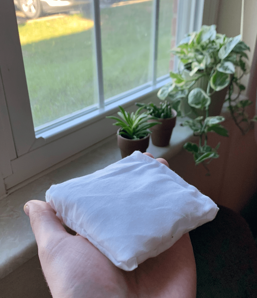
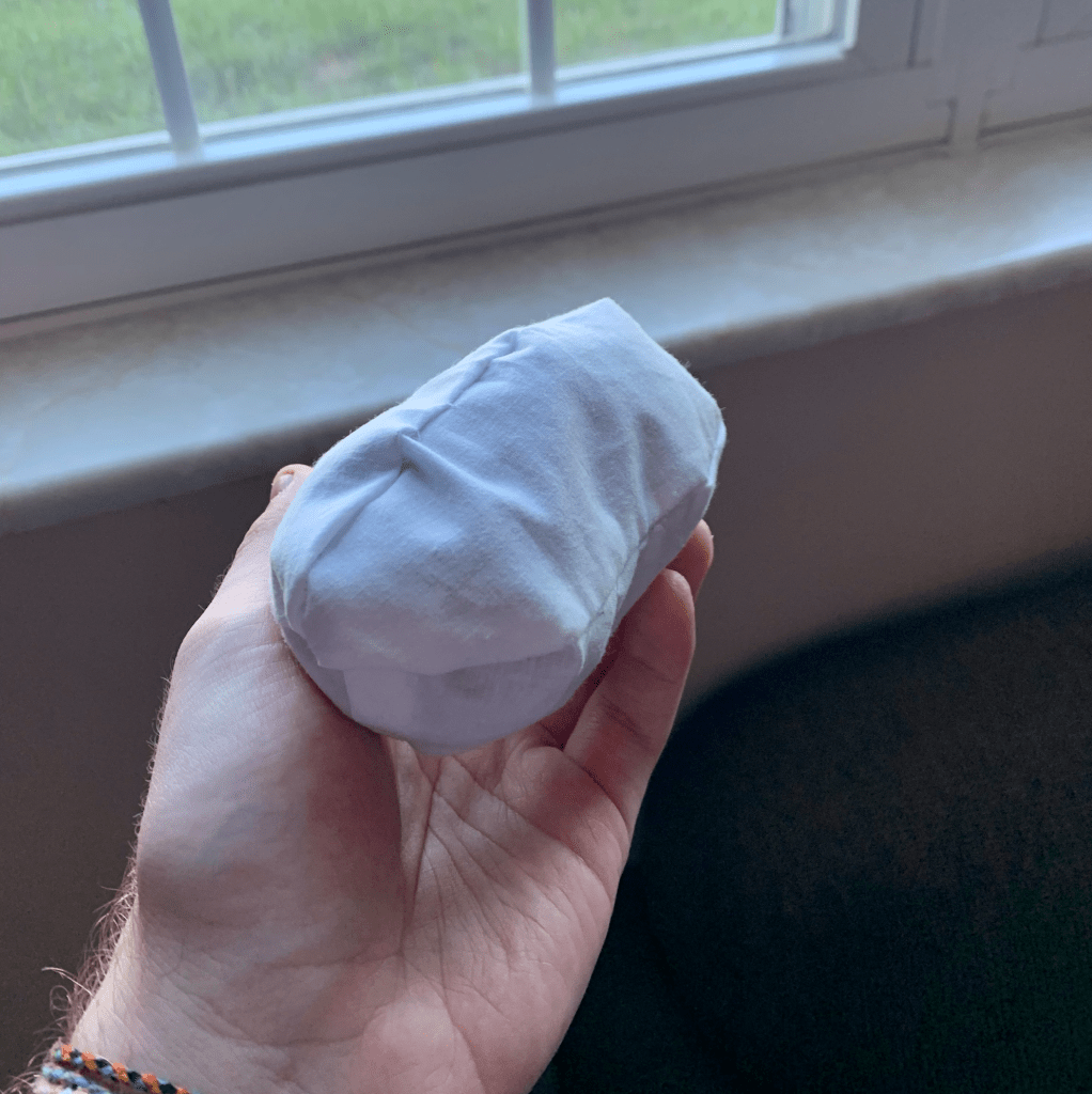
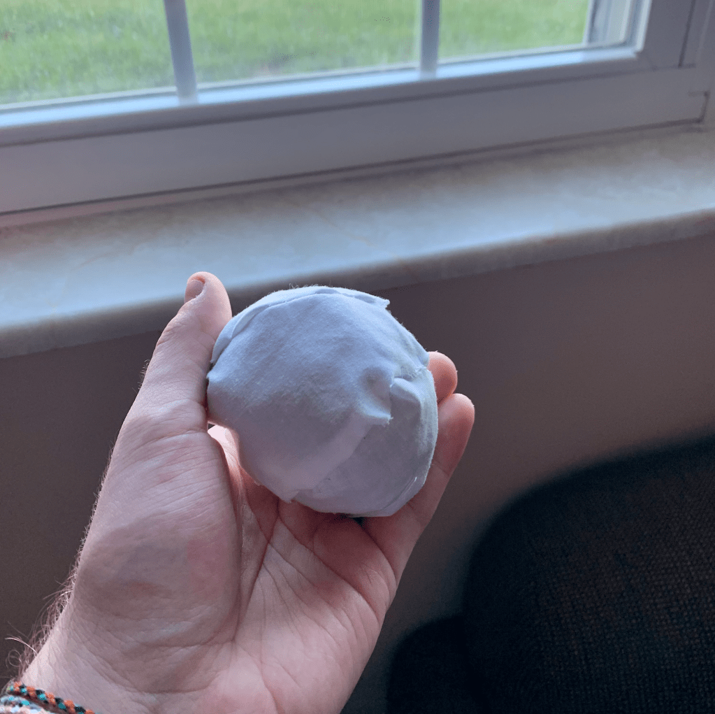
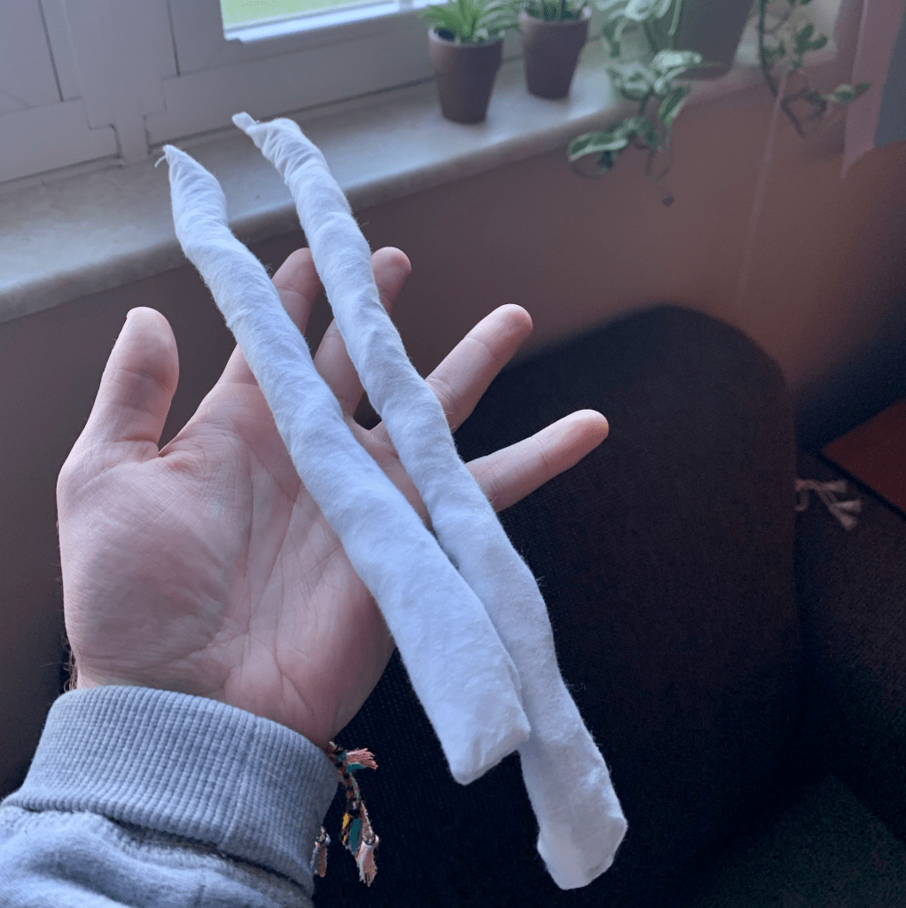
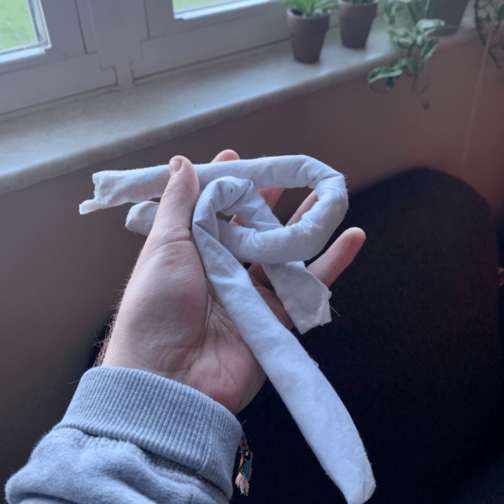
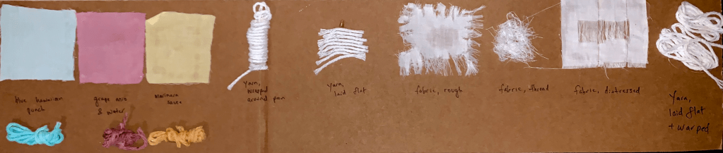
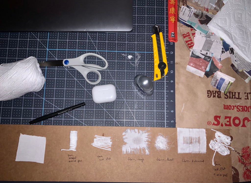
For my object of affection, I decided to recreate my favorite hat that I’ve had for almost 6 years. I chose this to recreate because I’ve had it for so long and you can tell – the colors are very faded (went from a deep navy to a faded purple/brown) and I’ve had many memories with it. It fits my head the best out of all the hats I own and is very soft and worn. Thus, I treated the surface as soft as possible. Because the object had to be paper mache, I had to make sure the material made it look soft, so I used yarn under some fabric that wasn’t attached all around to make it soft and somewhat moldable but still worked with the constraints of the project.
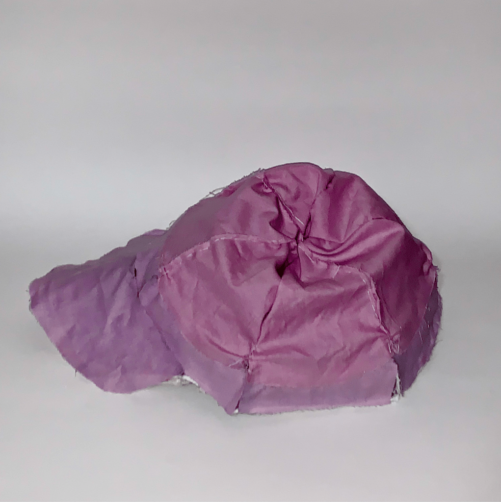
I dyed the fabric with grape mio, water, and a little bit of blue Hawaiian punch to get the perfect purple faded color and made it a little bit darker in some spots to get an uneven fade look. My intention with this was to recreate something that I use almost every day that will last me longer than this specific hat, while capturing this soft and worn feeling that I might forget one day in the future. Because of this, I now have a sort of replica of an everyday object that will not be around in 20 years, but I’ll still have this new object that’s somewhat of a snapshot of my favorite hat at this point in time. Even though my audience can’t get all of the memories that my actual hat has been through with me throughout the years, they can still feel the softness, flexibility, and worn features of this baseball cap through my recreation.

Objects of Affection
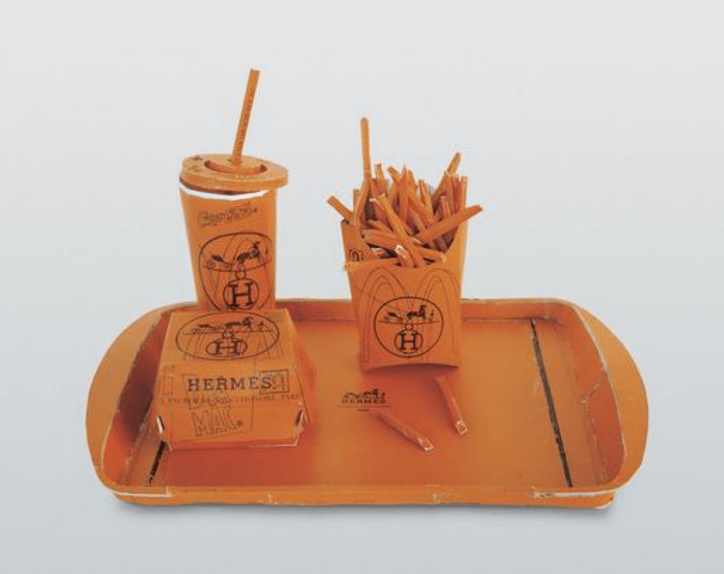
I chose the work Hermés Value Meal by artist Tom Sachs. He used prints and materials from designer brand Hermés to sculpt a fast food meal on a tray. To Sachs, like everyone else, the fast food meal likely just exemplifies a cheap (but probably tasty) meal, possibly commenting on the accessibility to food some parts of the urban United States only has. Words I would use to describe the material used to make up the object are luxury, branded, high living, materialistic, and possessive. The material used to make up the object isn’t actually taken from Hermés products but a paper used by the brand with obvious branding and a consistent color scheme.
To me, the combination of object and material creates a contrast between luxury and frugality with commentary on mass consumerism. There is a saying when it comes to this style of commentary that goes “it takes a whole cow to make a handbag while meat from a single cow can make a thousand burgers.” This doesn’t necessarily defend either one, as producing either uses unethical processes, so I think that the combination of these 2 industries while playing into the luxury vs. frugality idea is very important today.
3D Project 1 Recap
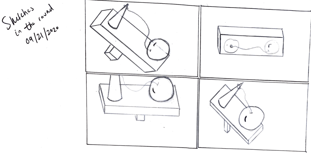
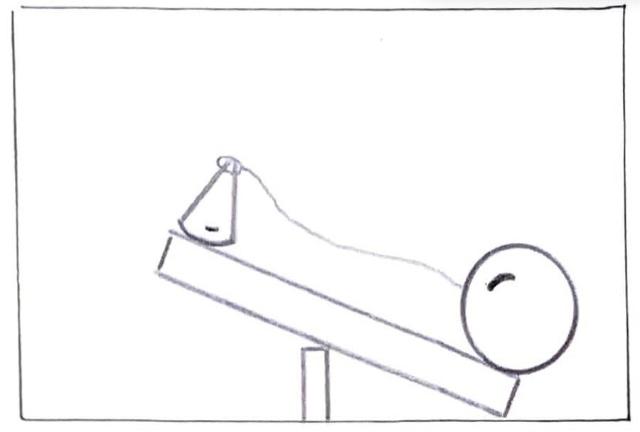
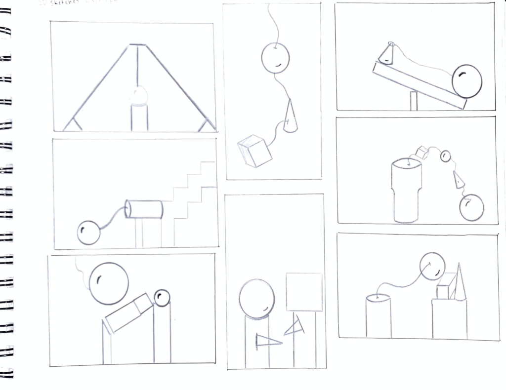
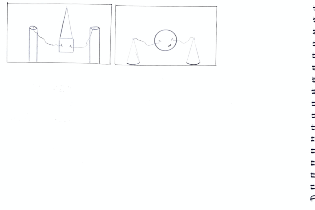
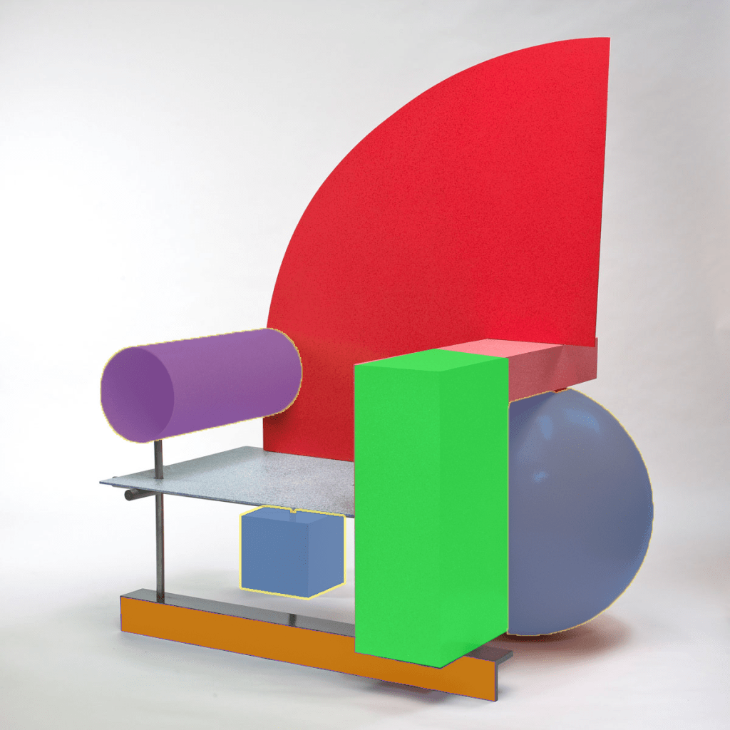
When sketching ideas for the project 1 final, I definitely had a lot of inspiration from Peter Shire, who makes playful and juvenile yet non-objective furniture and sculptures. From the feedback I got, I’m glad I was able to express the dynamism, tension, and balance I planned. One idea that I will use to push myself in the future regarding the object in the round is the relationship between the horizontal and vertical axes; the sculpture mainly focuses on the horizontal axis and to go to the next level there should be more of a balance between the two. However, the dynamism between the two objects on the platform connected through the string was definitely my main goal. I sketched with the sphere in mind but ended up using the cylinder because of its visual weight and also ended up tilting the cone itself on the platform from a sketch critique. Overall I had fun making this final project with the freedom we had after strict guidelines on the other shapes.
The Silver Pin Notes
In “The Silver Pin,” Susan Rubin Suleiman explains a very detailed memory of her family taking portraits in 1949 with specific reference to the pin her mother was wearing at the time. Even though the author associates this pin with memories of this past, her mother for some reason doesn’t value memories in the same way. That might be a reason she no longer wore the pin when they came to the United States, but everyone associates their past with different meanings. However, the overall message of this piece is the silver pin that has been and will be a piece of her past that will represent her mother forever.
The Case for Abstraction Notes
In the video, the narrator explains that abstraction has no definite starting point, but can be traced back roughly to the 19th century during the Industrial Revolution, when life started to change drastically, and art followed. There is no explicit genre that abstraction belongs to – it can be represented in painting, sculpting, drawing, or even photography. Each famous abstraction artist has different inspirations, like nature, architecture, spacial illusion, geometry, or a “realistic” approach to what they see day to day. These artists turn away from the material world, and therefore a representational approach to art, and use their inspiration and personal experience to represent objects or feelings in their own way.
3D Pure Forms Documented
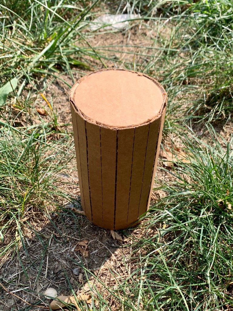
Hollow Cylinder 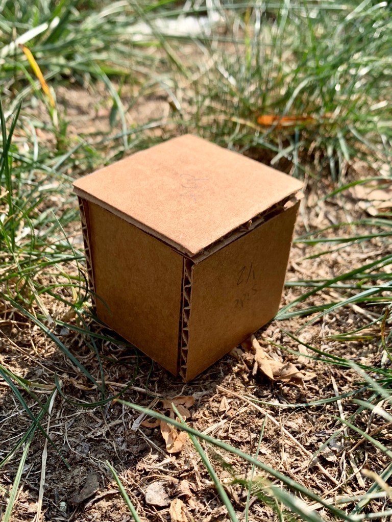
Hollow Cube 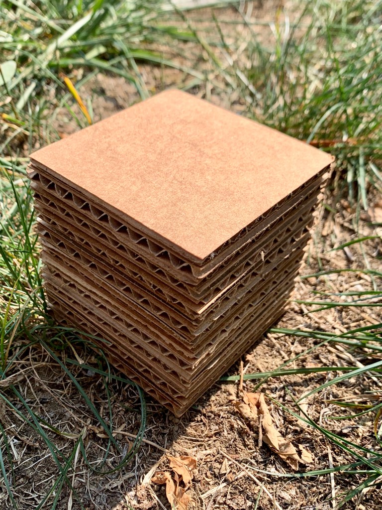
Laminated Cube 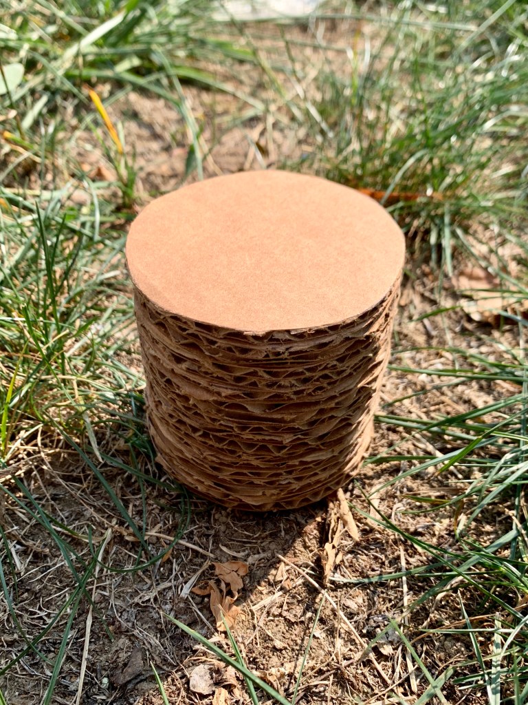
Laminated Cylinder 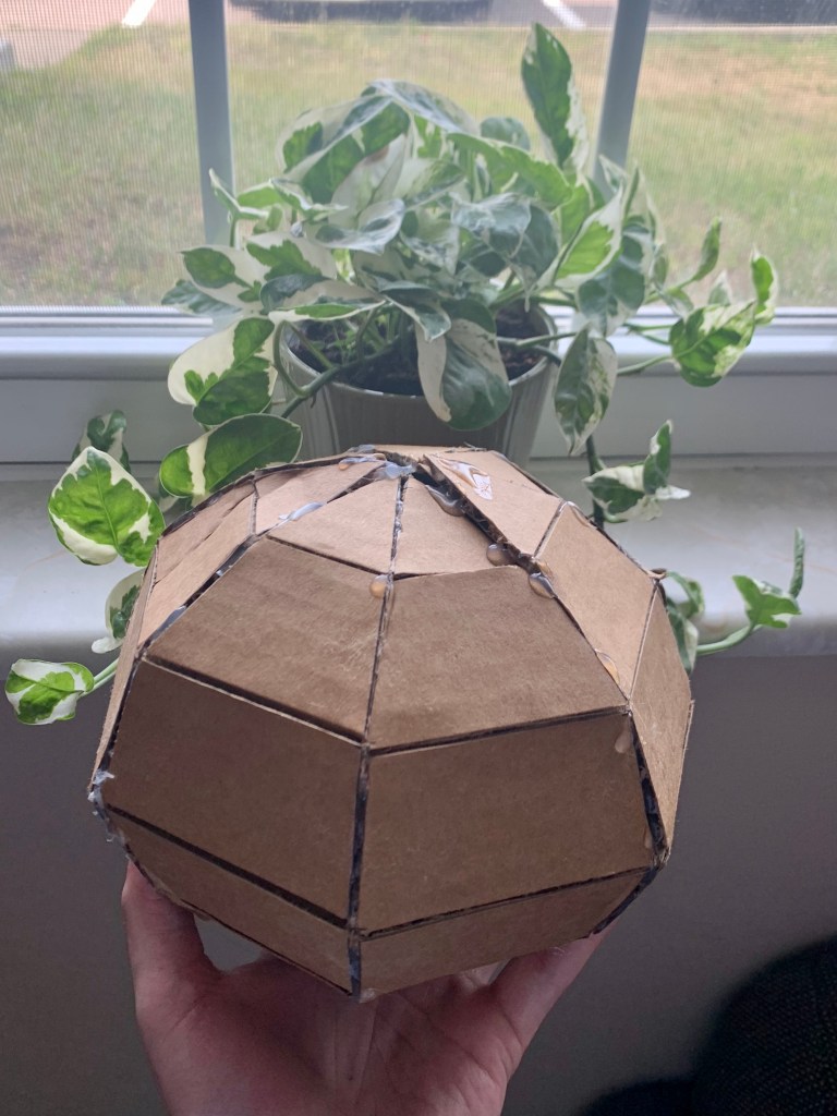
Hollow Sphere 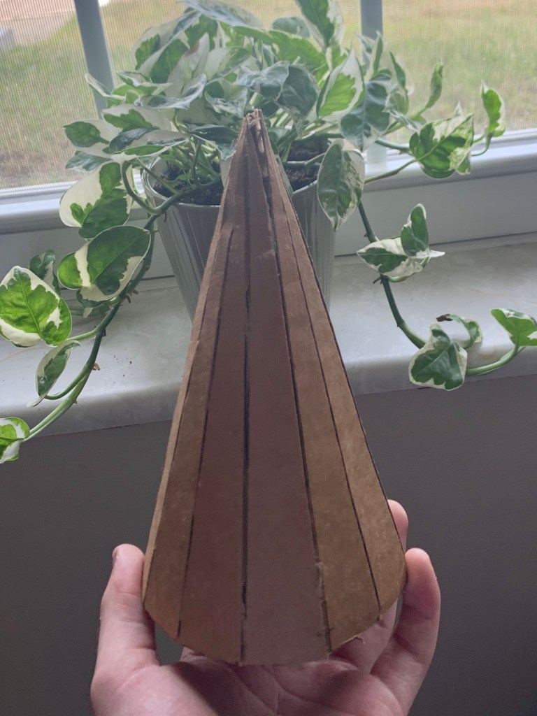
Hollow Cylinder 

Non-Objective Object Artist Research
Based in LA, Peter Shire is a sculptor who pulls inspiration from movements like Bauhaus and Art Deco while employing his own playful style. He was born and is still based in LA, and attributes his craftsmanship to his father’s influence with a background in furniture design. Using this inspiration, Shire went outside the boundaries of fine arts, including furniture and toys in his sculpting journey. His work walks a fine line between technology and aesthetics, which suggests his important additions to postmodern sculpting. Below I highlight one of his works’ use of pure forms.
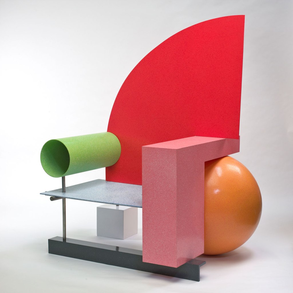
I chose Peter Shire to write about because his work is very unique and unlike anything I’ve seen in the past. His take on furniture is a very playful one, something that you might see in a kindergarten classroom but not juvenile enough to be used comfortably. This goes back to the idea of walking the line between technology and aesthetics; it’s not utilitarian art, but it’s also not completely counterproductive either. An aspect of fine art that’s important to almost anyone who enjoys art is how it looks and makes them feel which is why I think his work is unique. It looks playful enough to seem like a toy, but I still want it to be real, comfortable, and accessible furniture.
3D Form Walk Blog Post
Have you ever thought about the forms that make our physical world? Take a walk with your IDEA+file in hand. Map out your course as you walk…what forms are making up the physical space?…when and why did you stop? Or go?…what forms or structures dictate the way you move through or experience space?…did walking under a tree provide you with relief from the sun?…did anything cause you to change your course?
For my form walk, I walked around the Woodland cemetery which is close to my apartment building. Many of the forms that I took notice of were in the shape of headstones, so many straight-edged, rectangular, short objects made of stone were of interest to me. There were some larger headstones and memorials as well, but mostly the small and repetitive headstones were what I focused on. Also, there were trees, bushes, and flowers here and there, but seemingly broke up and contrasted the repetitive nature of the man-made headstones. I stopped a few times to read descriptions of some of the headstones but wasn’t looking for anything in particular. The forms of the headstones actually made me not get as close as I would to something I wanted to pay attention to out of respect to what they stand for – you never want to step on another person’s grave. All in all, the stones were laid out in a straightforward manner that kind of dictated your course for you and made the walk more of a collective experience rather than an individual/specific object kind of experience.
