Josef Albers was an educator, artist, and experimenter of color who was influential in art and psychology in the mid-20th century. In color theory, he utilized a trial and error method in order to come to his own conclusions, such as the relativity of color based on surrounding, contrasting colors, or the interaction of colors hinging on the illusion of the human eye. In this article, I found it surprising that he utilized such a method to discover revolutionary aspects of color that are clearly still relevant today in all artists’ research. Instead of a methodical approach to his research, he used a more primitive method with which he discovered radical ideas. The most interesting aspect of his findings, for me, was how he believed that the brain cheats us when it only sees what is expected, which made me analyze how I view (my) art, and will possibly affect me in my future work. I also learned that there is a foundation in him and his wife’s names, which stands for all aspects of art and the visual experience. Another thing I learned from the embedded links is that Albers has been compared to work of other psychologists interested in color such as Johann Wolfgang von Goethe, who refuted Sir Isaac Newton’s color theory by asserting that darkness is an active component rather than just being the absence of light.
Optical artist Tony DeLap was a prominent figure in the same category throughout the 20th century. He viewed his art as a competition with his ideas, always believing that a process or ideation for a work will always change as it progresses which is where the art comes in. Many of his pieces involve drawing, painting, sculpture, or a combination of multiple. Below, I’ll post some images of his work followed by my experience viewing them and my interpretations.
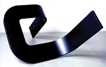
This abstract sculpture, titled Modern Times III from 1966, reminds me of an optical illusion like the impossible triangle. The fact that it’s all black is meaningful too, suggesting to me that just because the sculpture cuts off at two points doesn’t necessarily mean it “ends.” The darkness of the hue on the sculpture really hands the interpretation of the piece off to the context or setting it’s in, as the light in this image may not look the same as it would in a different place. Therefore, to me this can be interpreted in many different ways based on its context, but overall seems to be a multidimensional sculpture with very few visible expressions.
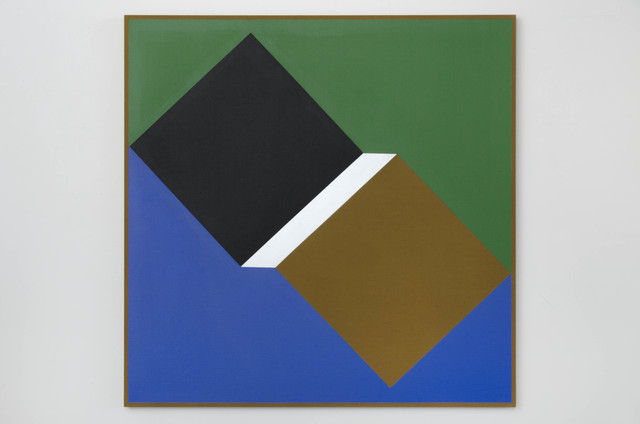
This painting, titled Card Trick from 2014, reminds me of a very basic 3-dimensional drawing that one would make with a stencil or ruler in an intro to art high school class. However, the relationship of the colors is what really makes it stand out. The coolness and symmetry of the blue and green sides make the geometrical shapes in the center stand out. The longer I stare at the white rectangle in the middle makes the relativity between the two squares get closer and farther away simultaneously, which makes me believe the color choice of white was very intentional as a focal point to really draw the viewer to engage in this optical illusion of a three dimensional space.
