

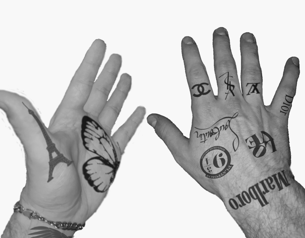
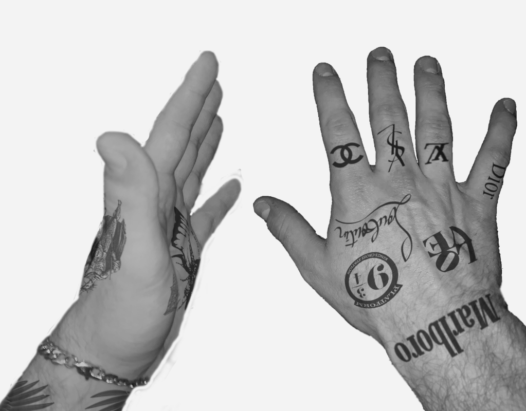
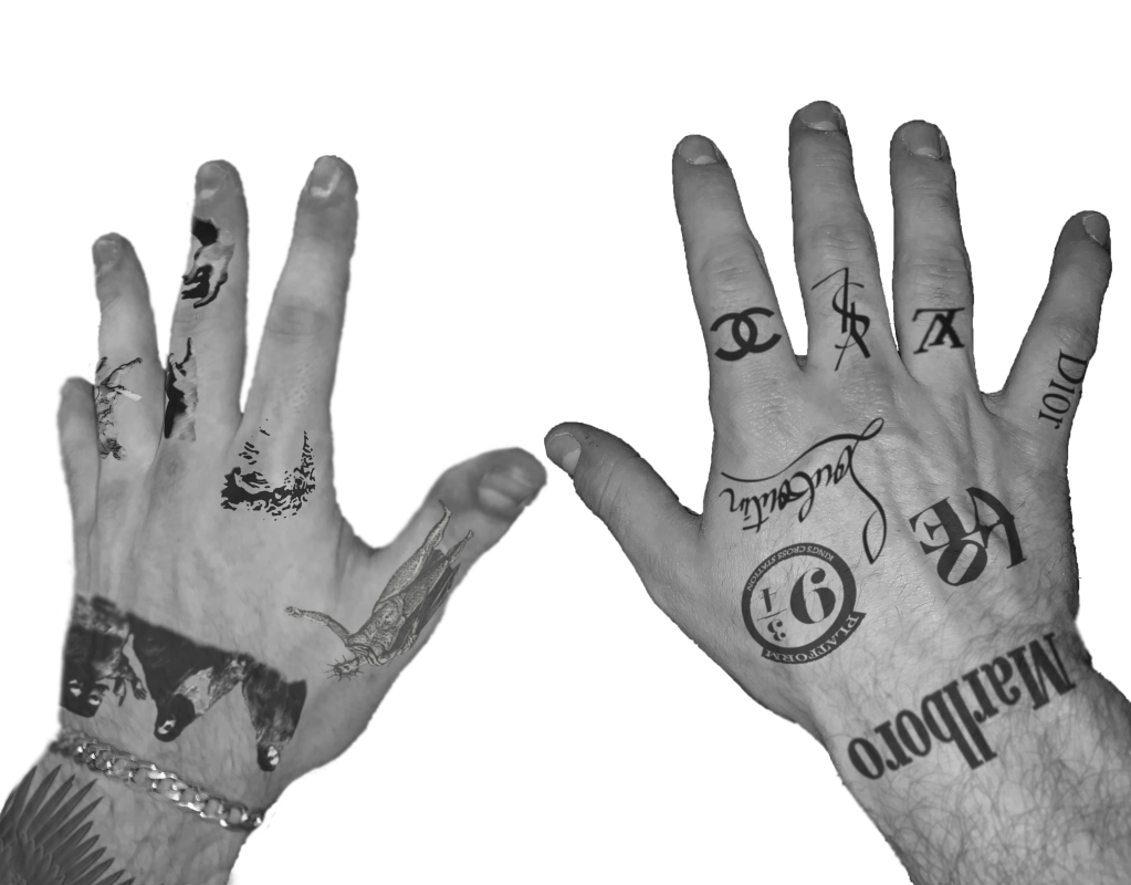
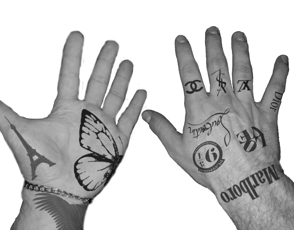
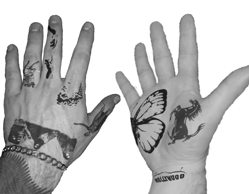
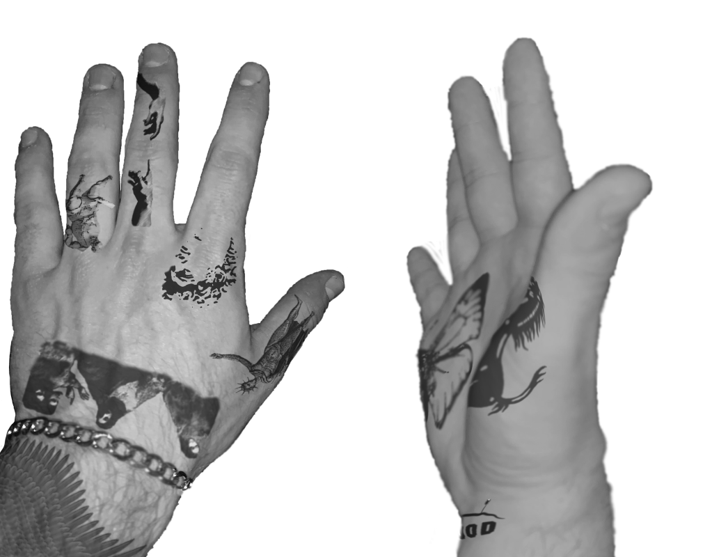
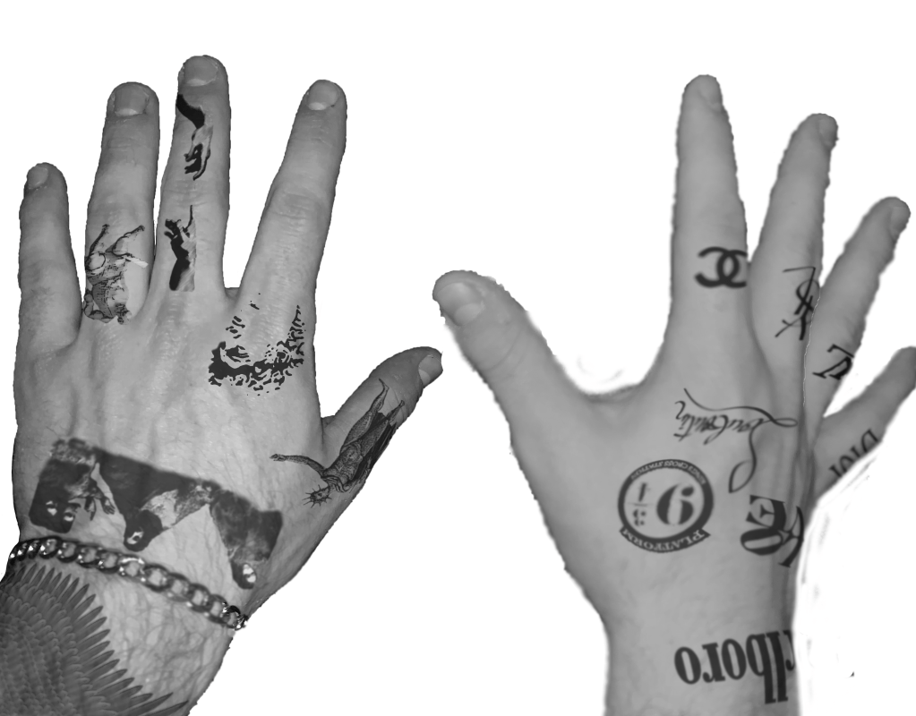
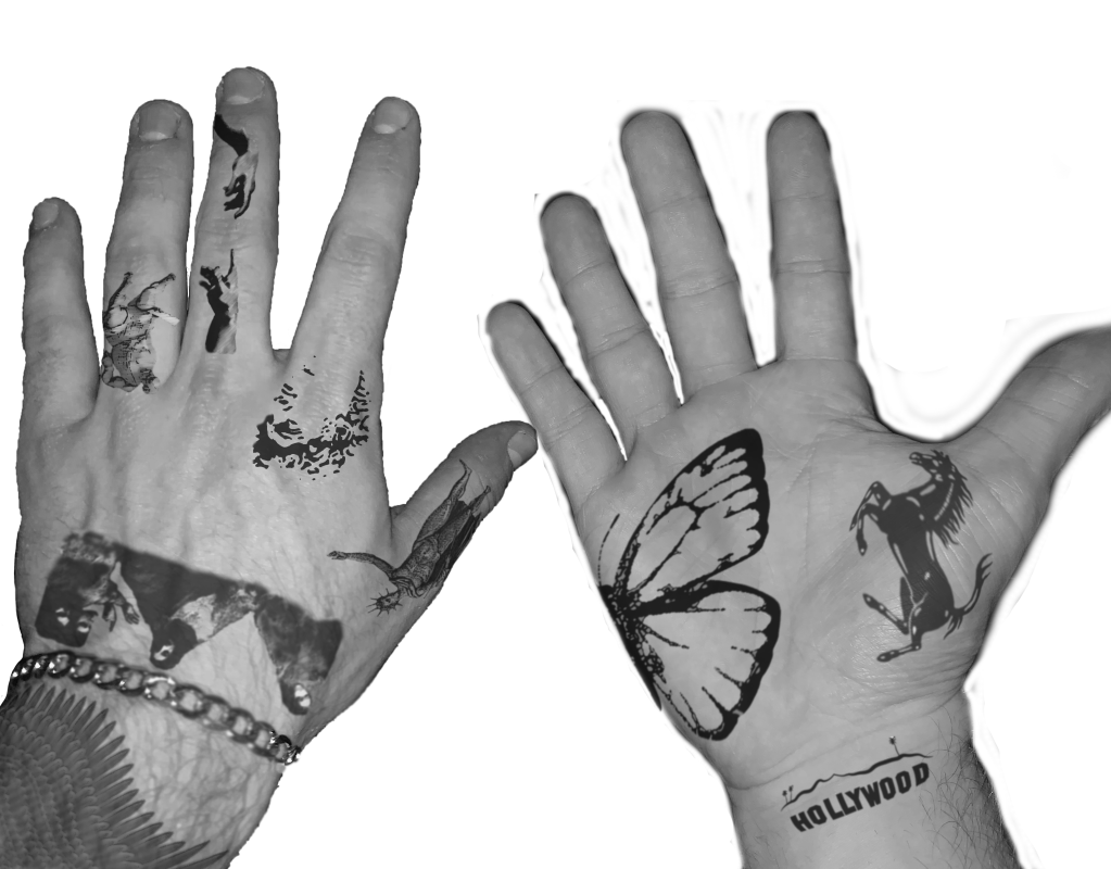

My goal for project 3.2 was to create a series of mockups of tattoos on my hands in a series of images that would convey motion. The motion is not only my hands moving but the movement of the “ink” as the skin stretches and warps in different placements and setups. Each mockup was created on Adobe Photoshop using photographs of my hands, then “tattoos” were added using Photoshop tools like warping, filters, and opacity. Then, the images were all printed and inserted into a physical flip book to push the idea of motion, which is captured below in a series of short videos that utilized the live photo feature on the iPhone.
The message that is conveyed with the distinct themes on each hand is the positives and negatives of tattooing as an art, or art in general. One is a “walking advertisement,” as many popular logos are used. This is a seemingly unoriginal way to approach art because these logos are unoriginal and promote materialism, while the other hand promotes classic art. Even though the inspiration for the classic art hand reuses pieces from art history, this is a more legitimate approach to tattooing and art in general as the reproduction of paintings is both a nod to the historical significance and the preservation of such important masterpieces.
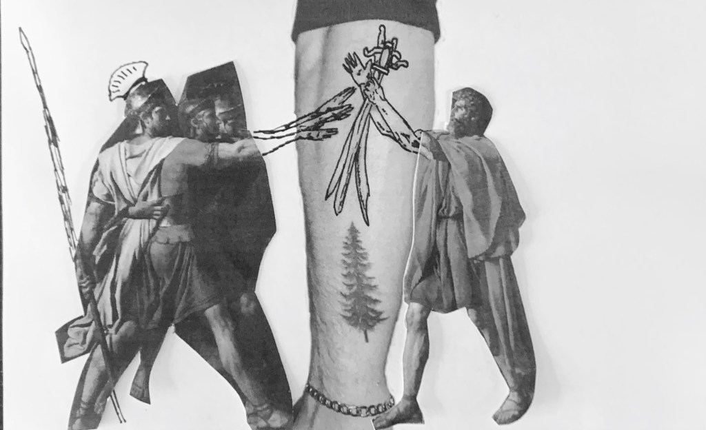
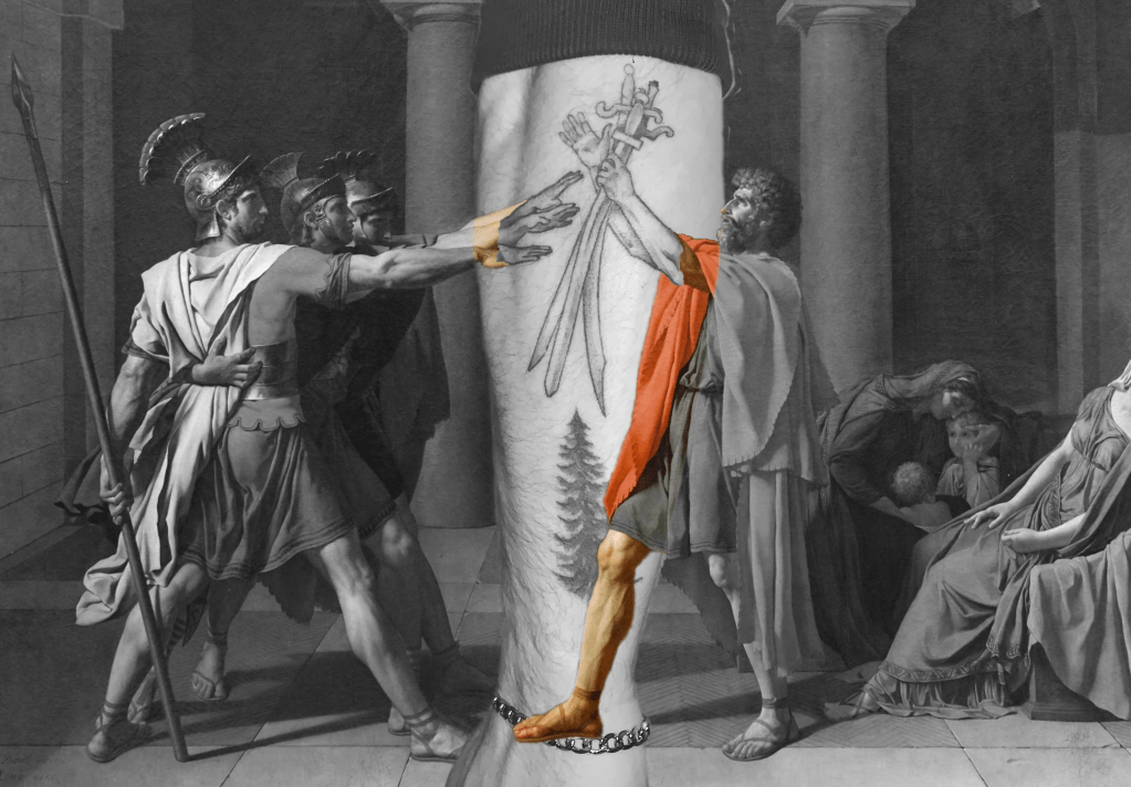
For the second deliverable of the project, I decided to use one of my own tattoos as inspiration. I have a detail of Jacque-Louis David’s Oath of the Horatii, 1784, on my outer forearm. I used Photoshop again to combine my tattooed arm and the painting to convey the motion of the arms’ capturing of anticipation that is evident in the actual painting. Not only does this signify the almost perfect scale and proportion that the tattoo artist left on my arm but the kinesthetic response that will be on my skin forever. For the physical aspect, I printed parts of the painting and a photo of my tattoo and added in pen detail to make the image half printed and half in ink like a tattoo artist would use.
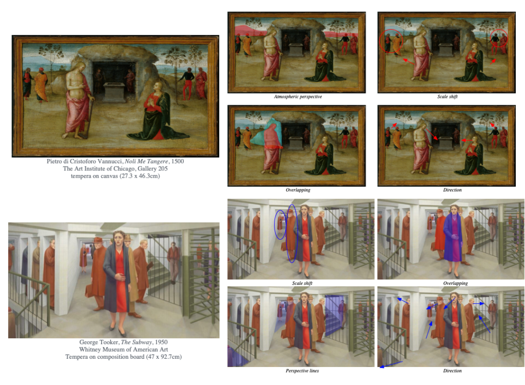
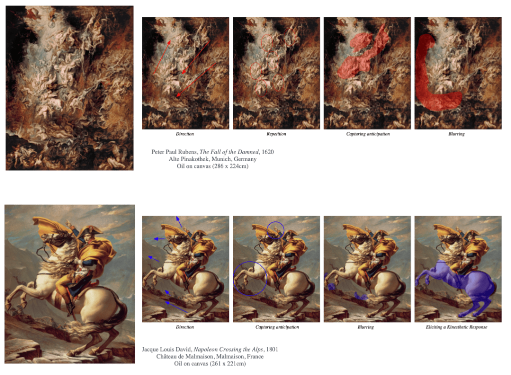
For the mapping aspect of the project, I used some of my knowledge from taking an art history course last semester to influence my choices in paintings. I learned that one point perspective wasn’t really discovered until sometime in the early 15th century, and not all artists utilized it commonly for awhile after. For that reason, I used Noli Me Tangere which was painted in a borderline 1500, so it doesn’t as comfortably use one point perspective as later paintings would. This creates an interesting illusion of space as atmospheric perspective was more heavily relied on. For The Subway, this is one of my favorite and also most confusing illusions of space in a painting which is why I wanted to analyze it. In The Fall of the Damned, there’s just so much going on and you can zoom in and look at details of it for a long time while imagining the motion taking place at the same time. Finally, Napoleon Crossing the Alps by my favorite painter David does a perfect job of capturing Napoleon on his horse mid charge (even if it never actually happened).
